Essentials
Accessibility
Keyboard accessibility is important for users who rely on or prefer using a keyboard. Encourage accessibility by providing keyboard functionality to all available content. Common keyboard interactions include using the Tab key to select different interactive elements on a page and using the Enter key or the Spacebar to activate an in-focus element.
Focus indicators
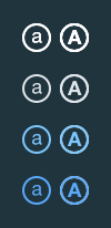
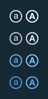
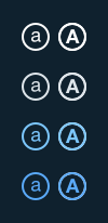
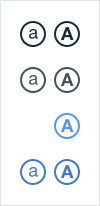
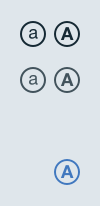
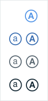
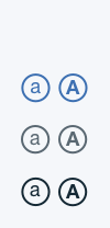
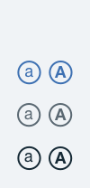
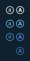
The Tab key navigates through various interactive elements on a page. A default visual indicator is provided by the web browser in use. The display is an outlined border around the focused element. When an element is in focus, it can be further activated using the keyboard.
Navigation order
The order in which interactive elements receive focus is logical and predictable. Create the tab flow hierarchy by using the source code to arrange the keyboard navigation. Begin with the header, followed by the main navigation, then page navigation (from left to right, top to bottom), and end with the footer.
Use natively-accessible elements in navigation to activate links, buttons, and form controls with a keyboard. Reinforce semantic HTML to convey intent and meaning instead of simply defining the look and feel of an element. Enhance with ARIA (Accessible Rich Internet Application) labels when necessary. For additional customization, use tabindex=“0” to ensure a navigable element receives a focus indicator.
Provide a “Skip to content” option when there is lengthy navigation so a user may access main content faster. This option is a link that is visually hidden by default and appears when it receives keyboard focus via the Tab key.
WebAIM recommends the following to enable a “Skip to content ”link.
<body>
    <a href="#maincontent">Skip to main content</a>
    ...
    <main id="maincontent>
    <h1>Heading</h1>
    <p>This is the first paragraph</p>
Dark UI color contrast | 4.5 : 1 Ratio
All type color combinations on Bluemix must pass WCAG AA standards of 4.5 : 1. In the table below are approved color combinations.
-

Normal text
-

Large text: 18px bold or larger
-
Dark Background Colors:
-

Navy-Gray 3
#2d4f49 -
Navy-Gray 2
#20343e -
IBM Blue 90
#152934 -
Navy-Gray 1
#0f212e
Type Colors:
-
White
#ffffff -
Navy-Gray 8
#dfe6eb -
IBM Blue 20
#7cc7ff -
IBM Blue 30
#5aaafa
-
-
Other Background Colors:
-
White
#ffffff -
Navy-Gray 8
#dfe6eb -

IBM Blue 30
#5aaafa -

IBM Blue 40
#5596e6
Type Colors:
-
IBM Blue 90
#152934 -
Navy-Gray 5
#42535c -
IBM Blue 40
#5596e6 -
IBM Blue 50
#4178be
-
Light UI color contrast | 4.5 : 1 Ratio
All type color combinations on Bluemix must pass WCAG AA standards of 4.5 : 1. In the table below are approved color combinations.
-
Normal text
-
Large text: 18px bold or larger
-
Light UI Background Colors:
-
White
#ffffff -
Gray 3
#f5f7fa -
Gray 2
#f0f3f6
Type Colors:
-
Blue-40
#5596e6 -
Blue-51
#3d70b2 -
Navy-Gray 6
#5a6872 -
Blue-90
#152935
-
-
Header Colors & Type Uses
-
Navy-Gray 1
#0f212e -

Blue 90
#152935 -

Navy-Gray 2
#20343e
Type Colors:
-
White
#ffffff -
Blue-20
#7cc7ff -
Blue-40
#5596e6 -
Blue-51
#3d70b2
-