See a problem with the code? Need a new component? Have feedback? We'd love to hear it all! The success of the Bluemix Design System relies on great people like yourself. Fill out the form below to submit your issue to our GitHub repo.
A member of the Bluemix Design System's team will be in touch within 48 hours.
Thank you!
Your issue, , is now in the bluemix-components repo. Click the issue number
to track the progress or make edits to your issue.
We will get back to you within 48 hours. Feel free to reach out to us on one of our slack channels if you have additional questions:
<a href='#' class='bx--tooltip__top' data-tooltip='This is some tooltip text'>Tooltip - hover</a><br>
  <div class='bx--tooltip__bottom' data-tooltip='This is some tooltip text'>Tooltip - hover</div>
Content
Length
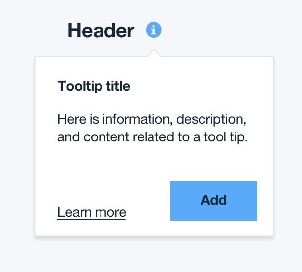
Due to its disruptive nature, tooltip content should be kept to an absolute minimum.
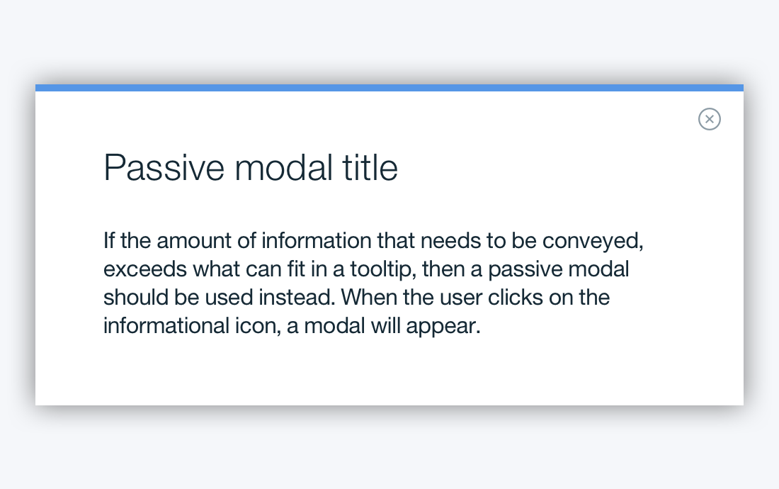
For larger sets of content or data, consider using a Passive Modal.
Interactive elements
The primary purpose of a tooltip is to provide additional help or context to an item. Therefore, they should contain read-only text. No interactive elements are permitted for use, including buttons or links.
Titles
A title may be used within a tooltip as a way to structure content.
Do:
Don't:
Interaction
Tooltips appear when the user hovers over an informational icon. When using a passive modal as a tooltip, the user may click on the information icon to view more content.
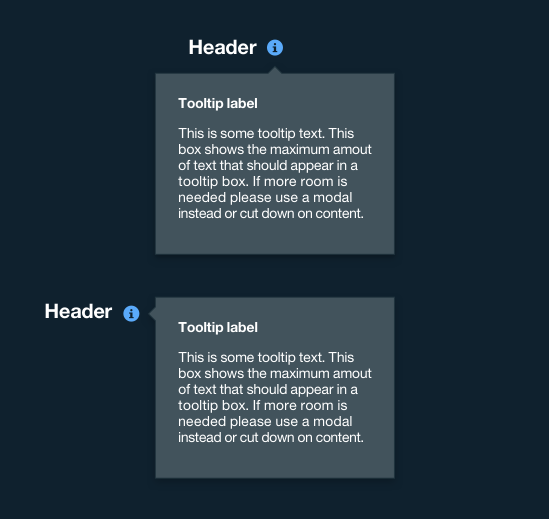
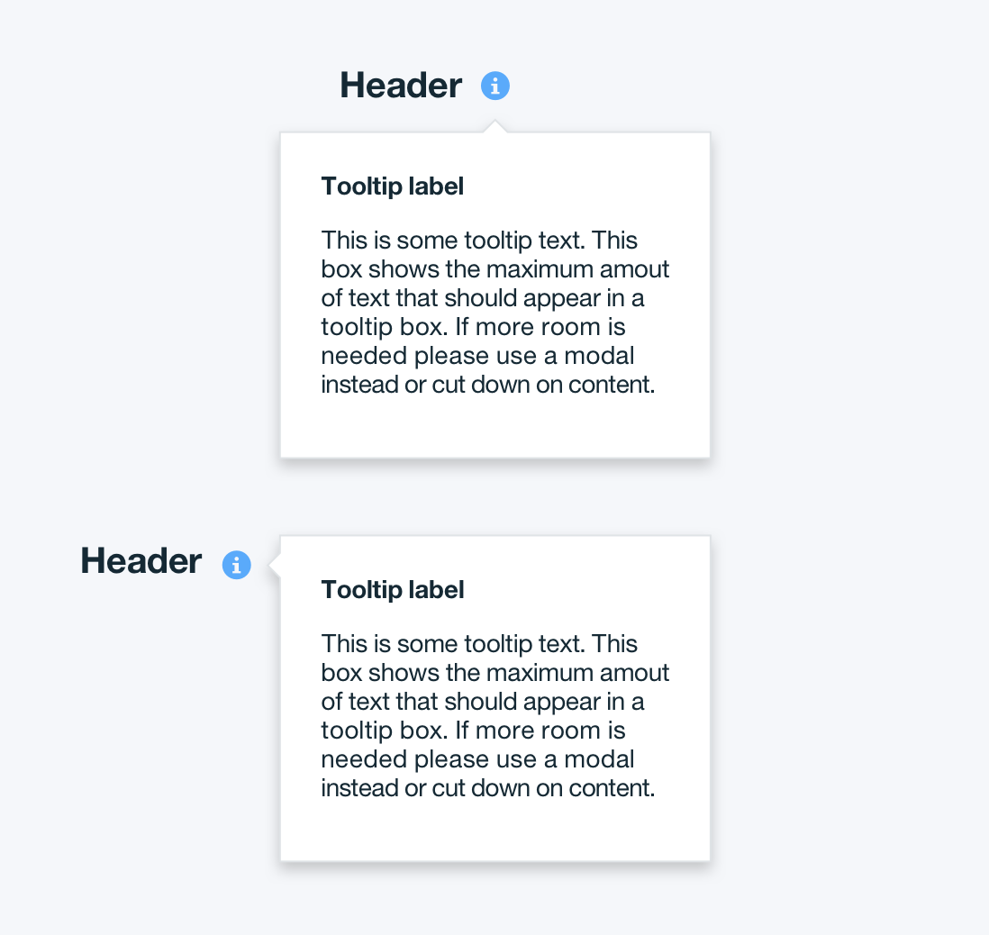
The width of a tooltip is fixed at 240px / 15em, however, the height varies based on content. The tooltip icon can be found in the Bluemix Icons Repo and the Bluemix Iconography Library.
Tooltip | units in px / em
Tooltip maximum sizing | units in px / em
Tooltip | units in px / em
Tooltip maximum sizing | units in px / em
PROPERTY
PX
REM
Width
240
15
Icon height & width
16
1
Box pointer
8
0.5
COLOR
HEX
SCSS VARIABLE
Icon color
#5aaafa
$color__blue-30
Box drop shadow
#000000 at 50% opacity
Tooltip height: varies based on amount of content
Padding
Internally, there must be 24px / 1.5rem of space between the tooltip text and the sides of the tooltip. Padding around the tooltip icon is 10px / .625rem.
Tooltip Padding | units in px / em
Tooltip Padding | units in px / em
PROPERTY
PX
REM
Padding between header and icon
10
0.625
Padding between icon and tooltip
10
0.625
Internal Padding
24
1.5
Placement
Tooltips should always be placed below the tooltip logo unless it is within the height of the tooltip box plus 16px / 1em of the bottom of the page. In that instance, the tooltip should appear to the right of the tooltip icon. On mobile, tooltips can only appear below the tooltip icon.
Tooltip placement
Tooltip placement
Tooltip placement
Tooltip placement
Tooltip placement below icon: bottom of tool tip must be at least 16px / 1em from the bottom of page
Typography
Tooltip labels should be set in title case with the first letter of each significant word capitalized. Tooltip text should be in sentence case with only the first word of every sentence capitalized. Text should follow the Typography font stack for sans-serif.
 Do:
Do: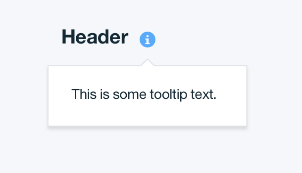
 Don't: