See a problem with the code? Need a new component? Have feedback? We'd love to hear it all! The success of the Bluemix Design System relies on great people like yourself. Fill out the form below to submit your issue to our GitHub repo.
A member of the Bluemix Design System's team will be in touch within 48 hours.
Thank you!
Your issue, , is now in the bluemix-components repo. Click the issue number
to track the progress or make edits to your issue.
We will get back to you within 48 hours. Feel free to reach out to us on one of our slack channels if you have additional questions:
<label for='textarea1' class='bx--form__label'>Text area label</label>
  <textarea id='textarea1' class='bx--textarea__input' rows='4' cols='50' placeholder='Hint text here'></textarea>
Labels
Effective form labeling helps users understand what information to enter into a text field. Using a placeholder (hint text) as a label is often applied as a space-saving method. However, this is not recommended because it hides context and presents accessibility issues. Hint text also increases cognitive load since users are forced to remember a label even after its filled out.
Accessibility best practices include:
Labels must be visible when a field gets focus.
Labels must be announced to the screen reader on focus.
Ensure the helper text that appears under a field is read when an assistive technology user stops at a field using ARIA.
Use sentence-style capitalization (only the first word in a phrase and any proper nouns capitalized).
Default values
Where possible, add programmatic assistance. Detect and pre-fill fields to reduce errors and save time. When the software can't determine the value that belongs in a field, use type-ahead to make suggestions. Use sentence-case for default values, detected values, and auto-completion text.
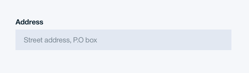
Placeholder text
Placeholder text provides hints or examples of what to enter. Placeholder text should disappear after the user has entered data into the text field. Use sentence-style capitalization, and in most cases, write the text as full sentences with punctuation. Examples are less likely to be written as full sentences with punctuation.
Placeholder text
Validation and errors
Real time validation helps to streamline the process and keep data clean when the user is filling out data. For full guidelines, refer to the Forms usage tab.
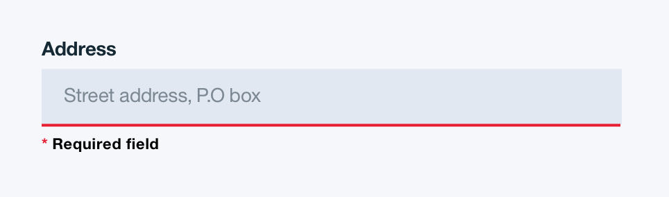
Text field validation for Required fields
Mobile
Text fields on mobile should typically be stacked vertically, with labels and or hints above each field.
Keyboard
When the user touches an input field, a cursor is displayed and the keyboard is shown.
Provide the keyboard that’s relevant to the data they are entering.
Structure
Basics
Text fields are a single color fill at 10% opacity. The width of a text field should appropriately fit the design and layout of the content.
Text field basics | units in px / rem
Text field basics | units in px / rem
COLOR
HEX
SCSS VARIABLE
Background
#ffffff at 10% opacity
$color__inputs--bg
COLOR
HEX
SCSS VARIABLE
Background
#3d70b2 at 10% opacity
$color__inputs--bg--light-ui
States
Default non-selected State: Browser defined Help: Tool tip should be left aligned with the text field box and underlined to indicate a link Disabled: 50% opacity
Text field states
Text field states
PROPERTY
PX
REM
Hover outline
1
-
Form validation bottom border
2
-
COLOR
HEX
SCSS VARIABLE
Form validation
#ff50f0
$color__red-40
Hover outline
#5aaafa
$color__blue-30
COLOR
HEX
SCSS VARIABLE
Form validation
#e71d21
$color__red-50
Hover outline
#5aaafa
$color__blue-30
Groupings
Text fields may be grouped horizontally and vertically for tablet and desktop views. Text fields cannot be grouped horizontally for mobile views.
Text field grouping orientations
Text field grouping orientations
PROPERTY
PX
REM
Padding between vertical groupings
32
2
Padding between horizontal groupings
16
2
Typography
Text field labels should be written in sentence case and should not exceed more than 3 words. Default values and placeholder text should also be written in sentence case. Default values and placeholder text should follow the typography font stack for sans-serif.