See a problem with the code? Need a new component? Have feedback? We'd love to hear it all! The success of the Bluemix Design System relies on great people like yourself. Fill out the form below to submit your issue to our GitHub repo.
A member of the Bluemix Design System's team will be in touch within 48 hours.
Thank you!
Your issue, , is now in the bluemix-components repo. Click the issue number
to track the progress or make edits to your issue.
We will get back to you within 48 hours. Feel free to reach out to us on one of our slack channels if you have additional questions:
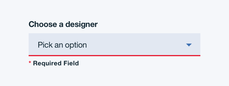
Labels are essential to the usability of forms because they provide guidance to the data a user might provide. Do not place a label inside a select element. Use sentence case and no more than 3 words.
Validation
Real time validation helps to streamline the process and keep data clean when the user is filling out data. For full guidelines, refer to the Forms usage tab.
Validation on Select element:
Order
The order of the select list should be based on the frequency of use. If applicable, the list should be in increasing order relative to the content. In cases of forms, alternative orders such as alphabetical may be more fitting. A horizontal rule can be used to group similar items together.
Styling select dropdowns
It is strongly recommended not to style select dropdowns due to accessibility purposes.
One of the WCAG 2.0 standards for accessibility is “Ensuring keyboard control for all functionality.” CSS alternatives to select elements to not meet this requirement.
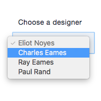
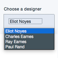
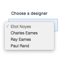
See below for examples on how a browser-specific select element renders differently:
Chrome:
Firefox:
Safari:
Accessibility
The default select element is completely usable either with a mouse or a keyboard, following this process:
Mouse: move your cursor over the select element
Keyboard: use the tab key to focus the select element
Mouse: click on the select element
Keyboard: press enter
Mouse: move your cursor over the desired option
Keyboard: use the top and bottom arrow keys to pick an option
Mouse: click on the desired option
Keyboard: press enter
While you can make a CSS dropdown easily usable by a mouse, making it usable with keyboard navigation is complex.
Structure
Basics
Select boxes are single color filled at 10% opacity. The width of a select box should appropriately fit the design and layout of the content.
PROPERTY
PX
REM
Height
40
2.5
COLOR
HEX
SCSS VARIABLE
Background
#ffffff at 10% opacity
$color__inputs--bg
COLOR
HEX
SCSS VARIABLE
Background
#3d70b2 at 10% opacity
$color__inputs--bg--light-ui
Padding
Select basics | units in px / rem
Select basics | units in px / rem
PROPERTY
PX
REM
Padding between label and select box
10
.625
Internal side padding
16
1
States
Default non-selected state: Browser defined Open: Style determined by browser Disabled: 50% opacity Help: Tool tip should be left aligned with the text field box and underlined to indicate a link.
PROPERTY
PX
REM
Hover outline
1
-
Form validation bottom border
2
-
COLOR
HEX
SCSS VARIABLE
Form validation
#ff50f0
$color__red-40
Hover outline
#5aaafa
$color__blue-30
COLOR
HEX
SCSS VARIABLE
Form validation
#e71d21
$color__red-50
Hover outline
#5aaafa
$color__blue-30
Select states
Select states
Groupings
Selects can be grouped horizontally and vertically for tablet and desktop views. Selects cannot be grouped horizontally for mobile views.
Select groupings orientations | units in px / rem
Select groupings orientations | units in px / rem
PROPERTY
PX
REM
Padding between vertical groupings
32
2
Padding between horizontal groupings
16
1
Typography
Select text should be set in sentence case, with only the first word in a phrase and any proper nouns capitalized. Select text should be 3 words or less. Select text should follow the typography font stack for sans-serif.