components
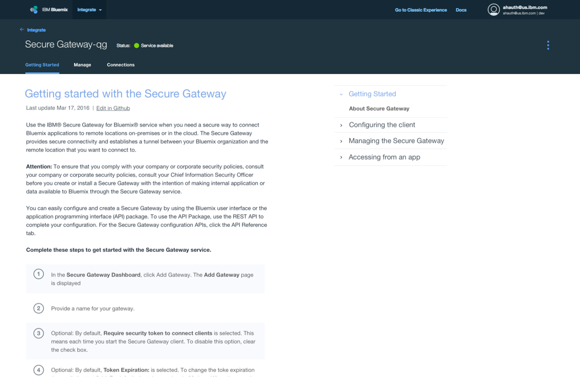
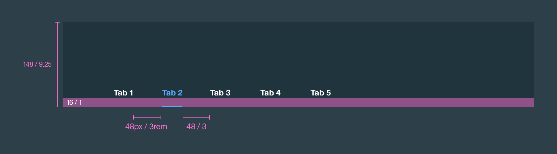
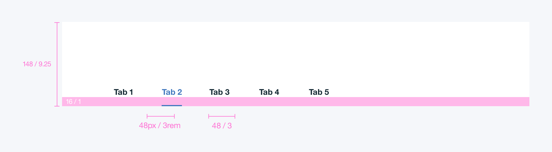
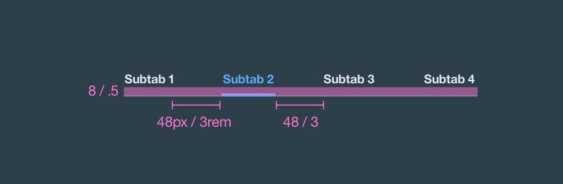
Tabs
Tabs are used to quickly navigate between views within the same context.
Foundation
Tabs
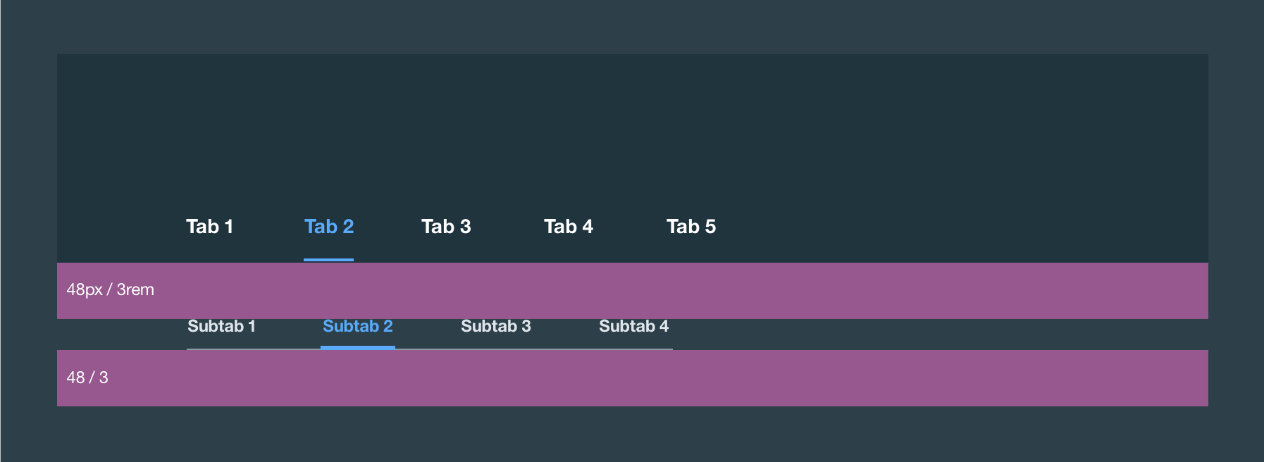
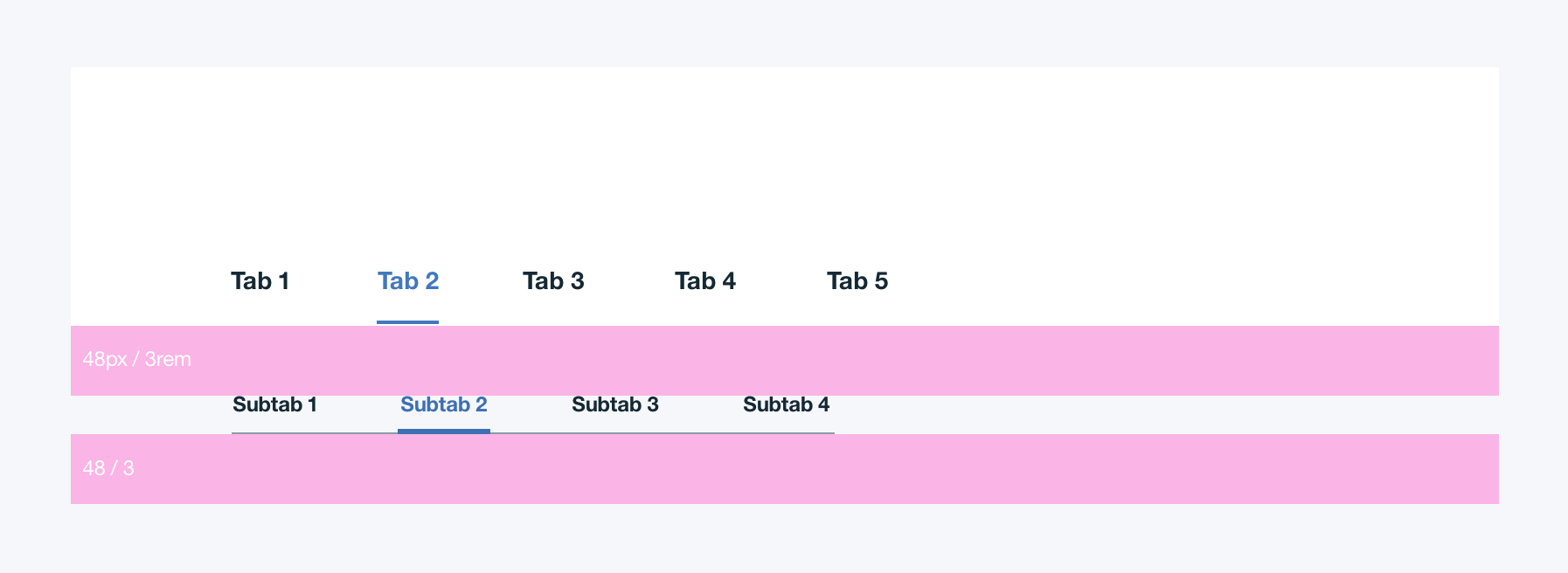
Tabs follow a modified Priority Plus pattern to provide optimal usability at all screen sizes. It is a responsive navigation pattern that maximizes horizontal space at all widths.
Demo: Overview
Demo: Containers Files
Demo: Connected Objects
Demo: Manage
Demo: API Reference
- HTML
- JS
<nav data-tabs class='bx--tabs' role='navigation'>
  <div class='bx--tabs__trigger'>
    <a href='javascript:void(0)' class='bx--tabs__trigger-text'></a>
    <svg>
      <use xlink:href='https://dev-console.stage1.ng.bluemix.net/api/v4/img/sprite.svg#service--down-arrow'></use>
    </svg>
  </div>
  <ul class='bx--tabs__nav bx--tabs--hidden' role='tablist'>
    <li class='bx--tabs__nav-item bx--tabs--selected' data-target='.demo--panel--overview' role='presentation'><a id='tab-link-1' class='bx--tabs__nav-link' href='javascript:void(0)' role='tab' aria-controls='tab-panel-1' aria-selected='true'>Overview</a></li>
    <li class='bx--tabs__nav-item' data-target='.demo--panel--containers' role='presentation'><a id='tab-link-2' class='bx--tabs__nav-link' href='javascript:void(0)' role='tab' aria-controls='tab-panel-2' aria-selected='false'>Containers Files</a></li>
    <li class='bx--tabs__nav-item' data-target='.demo--panel--connected' role='presentation'><a id='tab-link-3' class='bx--tabs__nav-link' href='javascript:void(0)' role='tab' aria-controls='tab-panel-3' aria-selected='false'>Connected Objects</a></li>
    <li class='bx--tabs__nav-item' data-target='.demo--panel--manage' role='presentation'><a id='tab-link-4' class='bx--tabs__nav-link' href='javascript:void(0)' role='tab' aria-controls='tab-panel-4' aria-selected='false'>Manage</a></li>
    <li class='bx--tabs__nav-item' data-target='.demo--panel--api-reference' role='presentation'><a id='tab-link-5' class='bx--tabs__nav-link' href='javascript:void(0)' role='tab' aria-controls='tab-panel-5' aria-selected='false'>API Reference</a></li>
  </ul>
  </nav>

  <!-- The markup below is for demonstration purposes only -->
  <div class='demo--panels'>
  <div id='tab-panel-1' class='demo--panel demo--panel--overview selected' role='tabpanel' aria-labelledby='tab-link-1'>
    <div class='bx--module--full'>
      <h2 class='bx--module__header'>Demo: Overview</h2>
    </div>
  </div>
  <div id='tab-panel-2' class='demo--panel demo--panel--containers' role='tabpanel' aria-labelledby='tab-link-2' hidden>
    <div class='bx--module--full'>
      <h2 class='bx--module__header'>Demo: Containers Files</h2>
    </div>
  </div>
  <div id='tab-panel-3' class='demo--panel demo--panel--connected' role='tabpanel' aria-labelledby='tab-link-3' hidden>
    <div class='bx--module--full'>
      <h2 class='bx--module__header'>Demo: Connected Objects</h2>
    </div>
  </div>
  <div id='tab-panel-4' class='demo--panel demo--panel--manage' role='tabpanel' aria-labelledby='tab-link-4' hidden>
    <div class='bx--module--full'>
      <h2 class='bx--module__header'>Demo: Manage</h2>
    </div>
  </div>
  <div id='tab-panel-5' class='demo--panel demo--panel--api-reference' role='tabpanel' aria-labelledby='tab-link-5' hidden>
    <div class='bx--module--full'>
      <h2 class='bx--module__header'>Demo: API Reference</h2>
    </div>
  </div>
  </div>
import eventMatches from '../polyfills/event-matches';
  import '../polyfills/array-from';
  import '../polyfills/element-matches';
  import '../polyfills/math-sign';
  import '../polyfills/object-assign';
  import ContentSwitcher from './content-switcher';

  class Tab extends ContentSwitcher {
  /**
   * Container of tabs.
   * @extends ContentSwitcher
   * @param {HTMLElement} element The element working as a container of tabs.
   * @param {Object} [options] The component options.
   * @param {string} [options.selectorMenu] The CSS selector to find the drop down menu used in narrow mode.
   * @param {string} [options.selectorTrigger] The CSS selector to find the button to open the drop down menu used in narrow mode.
   * @param {string} [options.selectorTriggerText]
   *   The CSS selector to find the element used in narrow mode showing the selected tab item.
   * @param {string} [options.selectorButton] The CSS selector to find tab containers.
   * @param {string} [options.selectorButtonSelected] The CSS selector to find the selected tab.
   * @param {string} [options.selectorLink] The CSS selector to find the links in tabs.
   * @param {string} [options.classActive] The CSS class for tab's selected state.
   * @param {string} [options.classHidden] The CSS class for the drop down menu's hidden state used in narrow mode.
   * @param {string} [options.eventBeforeSelected]
   *   The name of the custom event fired before a tab is selected.
   *   Cancellation of this event stops selection of tab.
   * @param {string} [options.eventAfterSelected] The name of the custom event fired after a tab is selected.
   */
  constructor(element, options) {
    super(element, options);

    this.element.addEventListener('keydown', (event) => { this.handleKeyDown(event); });

    const selected = this.element.querySelector(this.options.selectorButtonSelected);
    if (selected) {
      this.updateTriggerText(selected);
    }
  }

  /**
   * Internal method of {@linkcode Tab#setActive .setActive()}, to select a tab item.
   * @private
   * @param {Object} detail The detail of the event trigging this action.
   * @param {HTMLElement} detail.item The tab item to be selected.
   * @param {Function} callback Callback called when change in state completes.
   */
  _changeState(detail, callback) {
    super._changeState(detail, (error, ...data) => {
      if (!error) {
        this.updateTriggerText(detail.item);
      }
      callback(error, ...data);
    });
  }

  /**
   * Handles click on tab container.
   * * If the click is on a tab, activates it.
   * * If the click is on the button to open the drop down menu, does so.
   * @param {Event} event The event triggering this method.
   */
  handleClick(event) {
    super.handleClick(event);
    const button = eventMatches(event, this.options.selectorButton);
    const trigger = eventMatches(event, this.options.selectorTrigger);
    if (button) {
      super.handleClick(event);
      this.updateMenuState();
    }
    if (trigger) {
      this.updateMenuState();
    }
  }

  /**
   * Handles arrow keys on tab container.
   * * Up/Left keys are used to go to previous tab.
   * * Down/Right keys are used to go to next tab.
   * @param {Event} event The event triggering this method.
   */
  handleKeyDown(event) {
    const triggerNode = this.element.querySelector(this.options.selectorTrigger);
    if (triggerNode && triggerNode.offsetParent) {
      return;
    }

    const direction = {
      Left: -1,
      Right: 1,
      ArrowLeft: -1,
      ArrowRight: 1,
    }[event.key || event.keyIdentifier];

    if (direction) {
      const buttons = [...this.element.querySelectorAll(this.options.selectorButton)];
      const button = this.element.querySelector(this.options.selectorButtonSelected);
      const nextIndex = Math.max(buttons.indexOf(button) + direction, -1 /* For `button` not found in `buttons` */);
      const nextIndexLooped = nextIndex >= 0 && nextIndex < buttons.length ? nextIndex :
        nextIndex - (Math.sign(nextIndex) * buttons.length);
      this.setActive(buttons[nextIndexLooped], (error, item) => {
        if (item) {
          const link = item.querySelector(this.options.selectorLink);
          if (link) {
            link.focus();
          }
        }
      });
      event.preventDefault();
    }
  }

  /**
   * Shows/hides the drop down menu used in narrow mode.
   */
  updateMenuState() {
    this.element.querySelector(this.options.selectorMenu).classList.toggle(this.options.classHidden);
  }

  /**
   * Updates the text indicating the currently selected tab item.
   * @param {HTMLElement} target The newly selected tab item.
   */
  updateTriggerText(target) {
    this.element.querySelector(this.options.selectorTriggerText).textContent = target.textContent;
  }

  /**
   * The map associating DOM element and tab container instance.
   * @member Tab.components
   * @type {WeakMap}
   */
  static components = new WeakMap();

  /**
   * The component options.
   * If `options` is specified in the constructor, {@linkcode ContentSwitcher.create .create()}, or {@linkcode Tab.init .init()},
   * properties in this object are overriden for the instance being create and how {@linkcode Tab.init .init()} works.
   * @member Tab.options
   * @type {Object}
   * @property {string} selectorInit The CSS selector to find tab containers.
   * @property {string} [selectorMenu] The CSS selector to find the drop down menu used in narrow mode.
   * @property {string} [selectorTrigger] The CSS selector to find the button to open the drop down menu used in narrow mode.
   * @property {string} [selectorTriggerText]
   *   The CSS selector to find the element used in narrow mode showing the selected tab item.
   * @property {string} [selectorButton] The CSS selector to find tab containers.
   * @property {string} [selectorButtonSelected] The CSS selector to find the selected tab.
   * @property {string} [selectorLink] The CSS selector to find the links in tabs.
   * @property {string} [classActive] The CSS class for tab's selected state.
   * @property {string} [classHidden] The CSS class for the drop down menu's hidden state used in narrow mode.
   * @property {string} [eventBeforeSelected]
   *   The name of the custom event fired before a tab is selected.
   *   Cancellation of this event stops selection of tab.
   * @property {string} [eventAfterSelected] The name of the custom event fired after a tab is selected.
   */
  static options = Object.assign(Object.create(ContentSwitcher.options), {
    selectorInit: '[data-tabs]',
    selectorMenu: '.bx--tabs__nav',
    selectorTrigger: '.bx--tabs__trigger',
    selectorTriggerText: '.bx--tabs__trigger-text',
    selectorButton: '.bx--tabs__nav-item',
    selectorButtonSelected: '.bx--tabs__nav-item.bx--tabs--selected',
    selectorLink: '.bx--tabs__nav-link',
    classActive: 'bx--tabs--selected',
    classHidden: 'bx--tabs--hidden',
    eventBeforeSelected: 'tab-beingselected',
    eventAfterSelected: 'tab-selected',
  });
  }

  export default Tab;