Essentials
Grids
Grid systems are used for creating page layouts through a series of rows and columns that house your content. The Bluemix designs use a responsive, mobile first, fluid grid system that appropriately scales up to 12 columns as the device or viewport size increases.
Basic structure
-
1440 px
-
768 px
-
320 px
- Columns
- / Gutter
- / Margins
Key:
Grid with interior left navigation
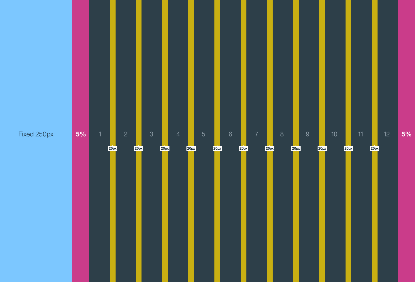
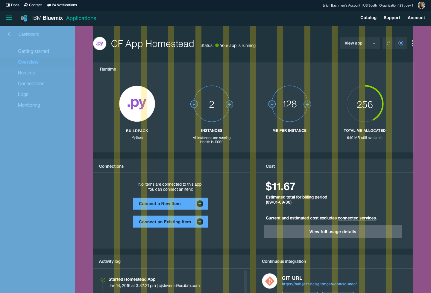
The interior left navigation lives outside the bounds of the grid. When using the interior left navigation, start the grid after indenting 250px from the left edge of the page (250px being the fixed width of the left navigation). Normal grid rules apply within the content area.
Grid area with left navigation: page width minus 250px from left edge.
- Columns
- / Gutter
- / Margins
Key:
How it works:
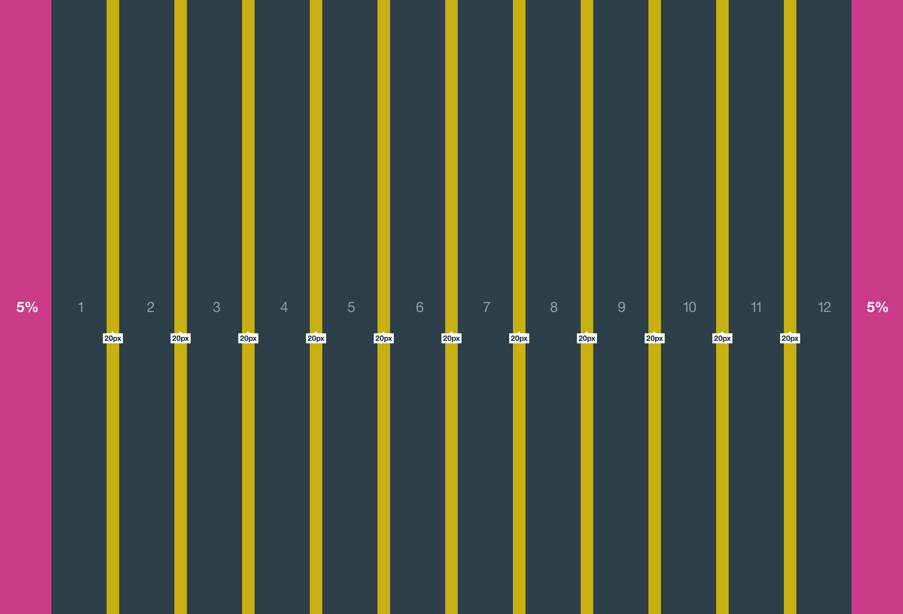
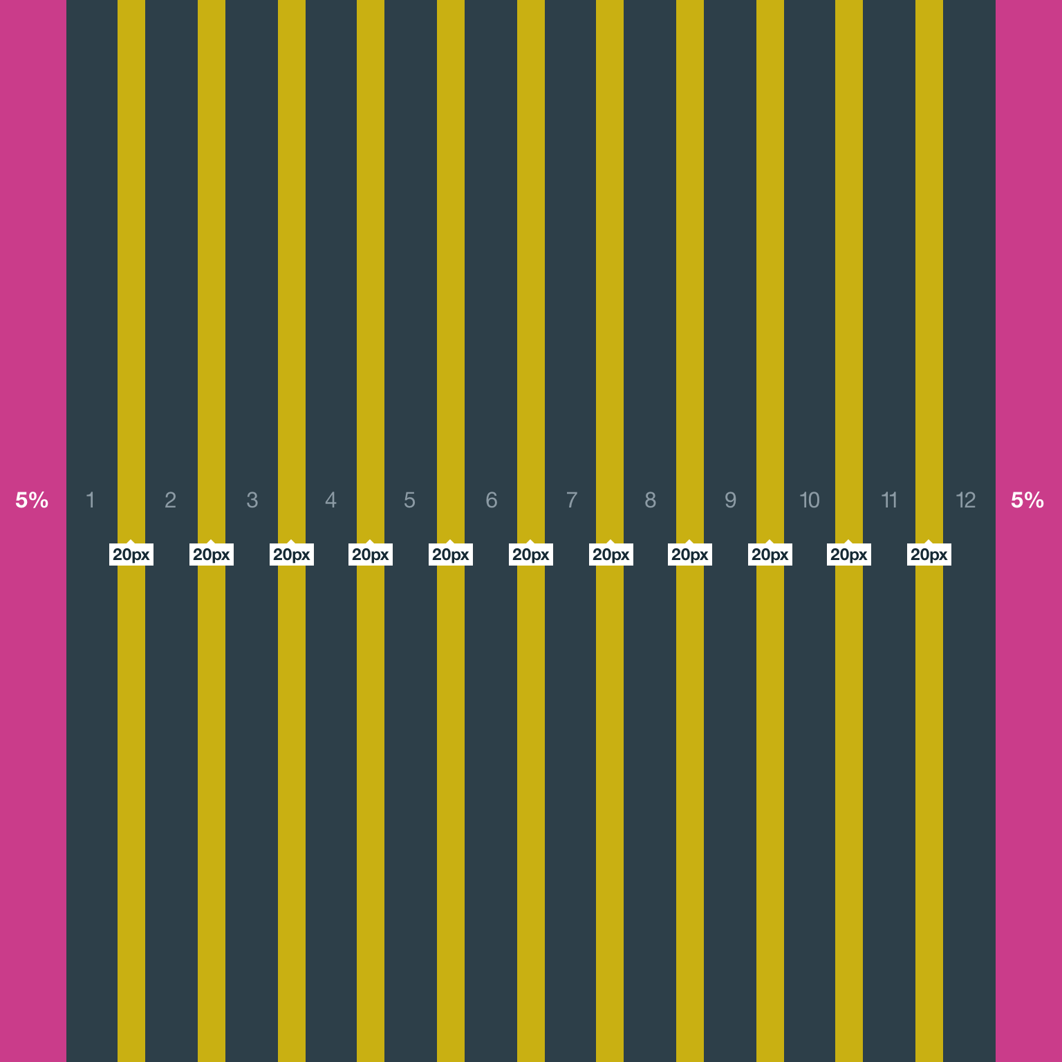
Gutters
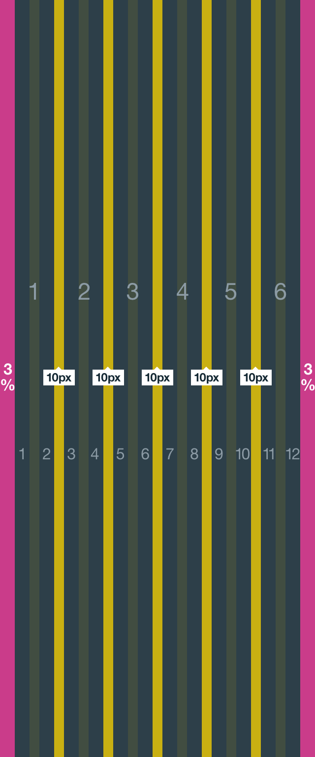
Columns create gutters (gaps between column content) through padding. For devices with a screen width greater than 768px, the column padding is 20px. For devices with a screen width less than 768px, the column padding is 10px.
Screen width ≥ 768px = 20px gutters
Screen width < 768px = 10px gutters
Columns
Bluemix designs should be limited to twelve columns. If designers feel that they need fewer columns in their grid, they can specify the number of twelve available columns they wish to span.
This can translate to percentages of the twelve columns. Using this method, a designer can create a folded, less granular grid. For example, if your component spans three equal columns, that is equal to 25% of twelve columns.
Column count: 12
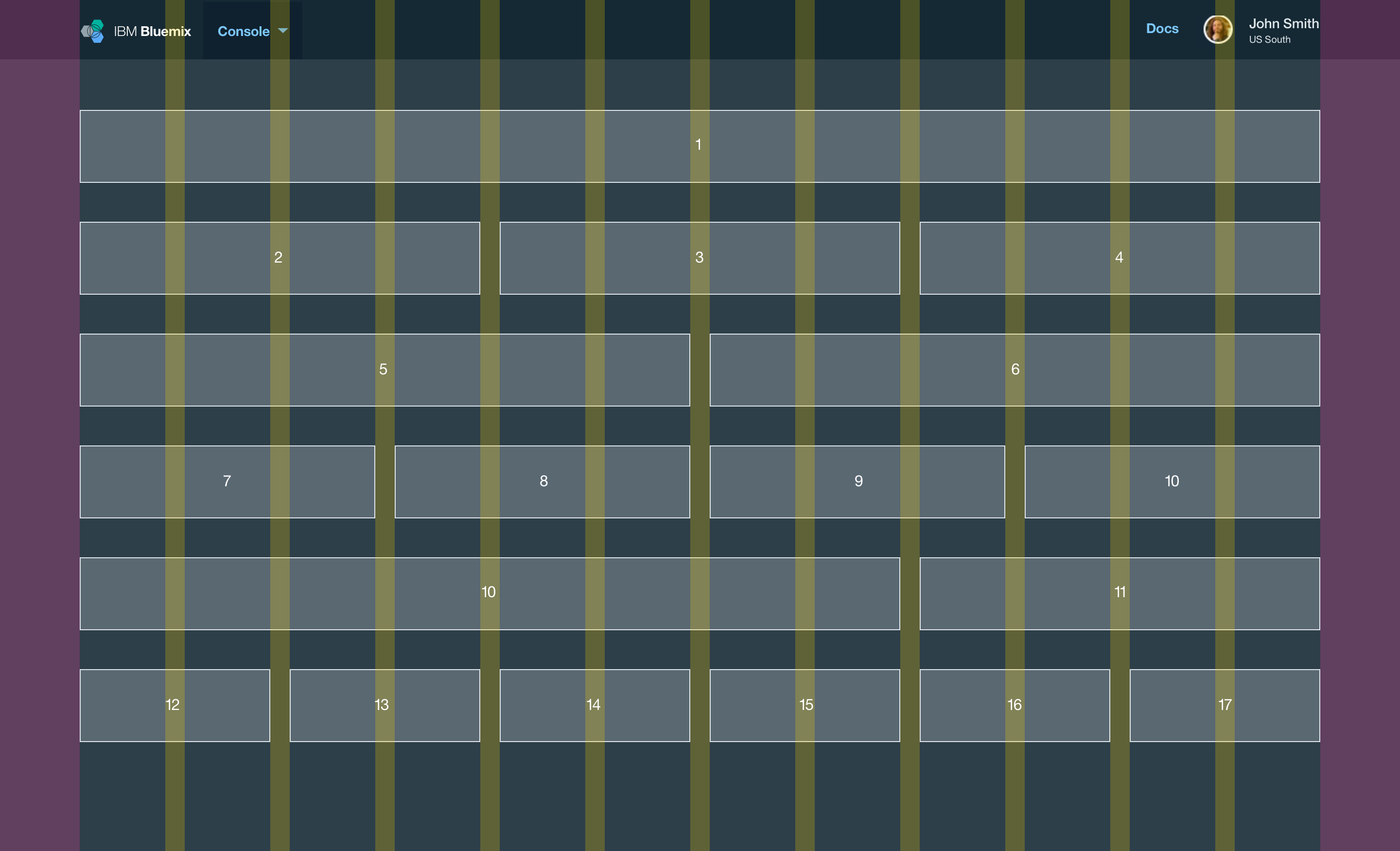
@1440px - 12 Columns / 20px Gutters / 5% Margins
Margins
The twelve column grid does not have a maximum width. It has a width of 100%, with built in margins that create padding between column count and the edges of the viewport.
In devices with a screen width greater than 768px, the margins are 5% on the left, and 5% on the right.
Example: Screen Width 768px
5% left = 38px (rounded to nearest whole pixel)
5% right = 38px (rounded to nearest whole pixel)
12 columns + gutters = 768px - 38px - 38px = 692px (rounded to nearest whole pixel)
In devices with a screen width less than 768px, the margins are 3% on the left, and 3% on the right.
Example: Screen Width 320px
3% left = 10px (rounded to nearest whole pixel)
3% right = 10px (rounded to nearest whole pixel)
12 columns + gutters = 320px - 10px - 10px = 300px (rounded to nearest whole pixel)
Breakpoints
-
Extra small devices Phones (< 768px)
12 Equal Columns
Column Padding: 5px left, 5px right
Gutter: 5px + 5px = 20px
Outer Margins: 3% left, 3% right -
Small devices Tablets (≥ 768px)
12 Equal Columns
Column Padding: 10px left, 10px right
Gutters: 10px + 10px = 20px
Outer Margins: 5% left, 5% right -
Medium devices Desktops (≥ 992px)
12 Equal Columns
Column Padding: 10px left, 10px right
Gutters: 10px + 10px = 20px
Outer Margins: 5% left, 5% right -
Large devices Desktops (≥ 1200px)
12 Equal Columns
Column Padding: 10px left, 10px right
Gutters: 10px + 10px = 20px
Outer Margins: 5% left, 5% right
Use the Grid
Starter grid templates can be found in the Design Kit. Included example grid sizes are 1440px, 768px and 320px.