See a problem with the code? Need a new component? Have feedback? We'd love to hear it all! The success of the Bluemix Design System relies on great people like yourself. Fill out the form below to submit your issue to our GitHub repo.
A member of the Bluemix Design System's team will be in touch within 48 hours.
Thank you!
Your issue, , is now in the bluemix-components repo. Click the issue number
to track the progress or make edits to your issue.
We will get back to you within 48 hours. Feel free to reach out to us on one of our slack channels if you have additional questions:
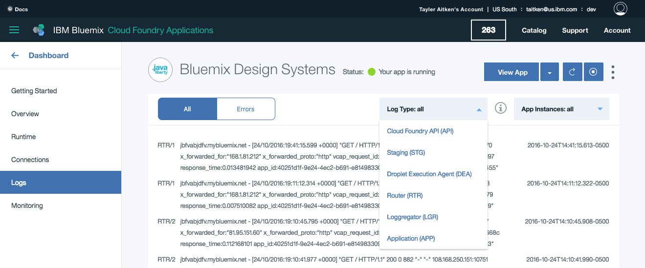
Limit dropdown content to a single line of text that describes the action it will perform when selected. Do not use multiple lines of text, images, or icons within a dropdown. Sort the items in logical order, such as grouping related options together.
Length
Keep dropdown options succinct. Long dropdowns that require scrolling make it difficult for users to see all their options in one glance.
Interaction
Dropdowns should appear on click rather than on hover. Hover-activated dropdowns increase cognitive load on users and are not recommended due to usability issues. Dropdowns should appear above all other elements within the UI. They can be dismissed by clicking outside of the dropdown item or on the parent element. Selecting an item from the dropdown will also dismiss it.
Usage
Small dropdown
Small dropdowns are commonly used in Tables. When using a small dropdown for a number selection, the increments in the dropdown should be 10, 25, 50 and 100. The maximum amount of items a user can see per page is 100.
There are two types of dropdowns, large and small. Regardless of size, dropdowns have two states, open and closed. AN open and closed dropdown should be the same width and appropriately fit the design, layout, and content. The height of a closed dropdown stays consistent while the height of an open dropdown will vary based on the amount of options it has. Please note the various color differences for closed and open dropdowns.
Dropdown basics | units in px / rem
Dropdown basics | units in px / rem
PROPERTY
PX
REM
Height
40
2.5
Small dropdown height
24
1.5
Small dropdown width
56
3.5
Width: Varies based on content and layout
Closed dropdown
COLOR
HEX
SCSS VARIABLE
Background - closed
#ffffff at 10% opacity
$color__inputs--bg
Background - open
#ffffff at 10% opacity
$color__inputs--bg
Drawer background - open
#394b54
$color__navy-gray-4
Caret
#5aaafa
$color__blue-30
Text
#ffffff
$color__white
COLOR
HEX
SCSS VARIABLE
Background - closed
#3d70b2 at 10% opacity
$color__inputs--bg--light-ui
Background - open
#3d70b2 at 10% opacity
$color__inputs--bg--light-ui
Drawer background - open
#ffffff
$color__white
Caret
#3d70b2
$color__blue-51
Text
#152935
$color__blue-90
Large Dropdown
Large dropdown basics | units in px / rem
Large dropdown basics | units in px / rem
Small dropdown
Whichever number is displayed at the top of the dropdown box, the corresponding number in the list below should have a checkmark next to it, indicating which number is the one currently selected. The icon for the check mark can be found in the Iconography Library or the Icons Repo.
PROPERTY
PX
REM
Height
24
1.5
Small dropdown width
56
3.5
Small dropdown basics | units in px / rem
Small dropdown basics | units in px / rem
Padding
Large dropdown
PROPERTY
PX
REM
Internal side padding
16
1
Large dropdown padding | units in px / rem
Large dropdown padding | units in px / rem
Small dropdown
PROPERTY
PX
REM
Internal side padding
8
0.5
Small dropdown padding | units in px / rem
Small dropdown padding | units in px / rem
States
In addition to the open and closed states, dropdowns have hover, new selection, and disabled states.
Dropdown
PROPERTY
PX
REM
Hover border
1px solid border
-
COLOR
HEX
SCSS VARIABLE
Hover color
#5aaafa
$color__blue-30
New selection color fill
#5aaafa
$color__blue-30
Disabled
@50% opacity
Large dropdown states
Large dropdown states
Small dropdown
PROPERTY
PX
REM
Hover border
1px solid outline
-
COLOR
HEX
SCSS VARIABLE
Hover color
#5aaafa
$color__blue-30
Open hover color
#5aaafa
$color__blue-30
STATE
HEX
SCSS VARIABLE
Hover
#3d70b2
$color__blue-51
Open hover
#5596e6
$color__blue-40
Disabled
@50% opacity
Small dropdown states
Small dropdown states
Typography
All dropdown text should be set in sentence case with the first letter of each word capitalized. Dropdown options should not exceed more than 3 words. Text should follow the typography font stack for sans-serif.