Essentials
Colors
Color brings a design to life. Color is versatile; it's used to express emotion and tone, as well as place emphasis and create associations. Color should always be used in meaningful and intentional ways that create patterns and visual cues.
Light UI Color Scheme
-
Copy HEX
White
#ffffff
$color__white
-
Copy HEX
Gray 3
#f5f7fa
$color__gray-3
-
Copy HEX
Gray 2
#f0f3f6
$color__gray-2
-
Copy HEX
Gray 1
#dfe3e6
$color__gray-1
-
Copy HEX
IBM Blue 51
#3d70b2
$color__blue-51
-
Copy HEX
IBM Blue 40
#5596e6
$color__blue-40
-
Copy HEX
IBM Blue 30
#5aaafa
$color__blue-30
-
Copy HEX
IBM Blue 20
#7cc7ff
$color__blue-20
-
Copy HEX
Navy-Gray 1
#0f212e
$color__navy-gray-1
-
Copy HEX
IBM Blue 90
#152935
$color__blue-90
-
Copy HEX
Navy-Gray 3
#2d3f49
$color__navy-gray-3
-
Copy HEX
Navy-Gray 6
#5a6872
$color__navy-gray-6
-
Copy HEX
Navy-Gray 7
#8c9ba5
$color__navy-gray-7
Accent Colors
-
Copy HEX
IBM Teal 20
#6fedd8
$color__teal-20
-
Copy HEX
IBM Teal 50
#008571
$color__teal-50
-
Copy HEX
IBM Green 40
#5aa700
$color__green-40
-
Copy HEX
IBM Green 50
#4b8400
$color__green-50
-
Copy HEX
IBM Yellow 30
#efc100
$color__yellow-30
-
Copy HEX
IBM Red 40
#ff5050
$color__red-40
-
Copy HEX
IBM Red 50
#e71d32
$color__red-50
-
Copy HEX
IBM Purple 60
#734098
$color__purple-60
Color Contrast | 4.5 : 1 Ratio
All type color combinations on Bluemix must pass WCAG AA standards of 4.5 : 1. In the table below are approved color combinations.
-

Normal Text
-

Large Text: 18px bold or larger
-
Light UI Background Colors:
-

White
#ffffff -
Gray 3
#f5f7fa -

Gray 2
#f0f3f6
Type Colors:
-
Blue-40
#5596e6 -
Blue-51
#3d70b2 -
Navy-Gray 6
#5a6872 -
Blue-90
#152935
-
-
Header Colors & Type Uses
-

Navy-Gray 1
#0f212e -

Blue 90
#152935 -

Navy-Gray 2
#20343e
Type Colors:
-
White
#ffffff -
Blue-20
#7cc7ff -
Blue-40
#5596e6 -
Blue-51
#3d70b2
-
Light UI Color Usage
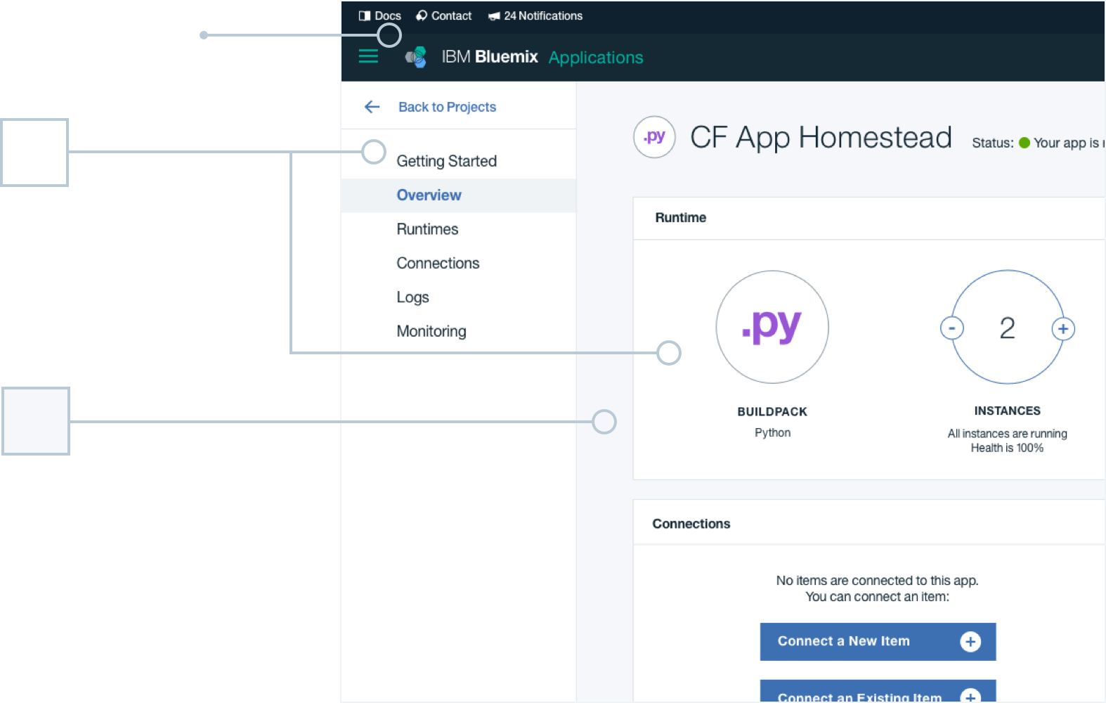
The base background color for Light UI is Gray-3. The global header is the uniting element between the Dark and Light UI themes, and therefore remains dark and does not change between the two themes. Type and other native elements and components can live either on the base Gray-3 or on a layered white module or container.
-
Unchanged Global Dark UI Header
-
Layer 2
White
#fffff
Added layer background color
-
Layer 1
Gray 3
#f5f7fa
Base background color
Additional Resources
Color brings a design to life. Color is versatile; it's used to express emotion and tone, as well as place emphasis and create associations. Color should always be used in meaningful and intentional ways that create patterns and visual cues.
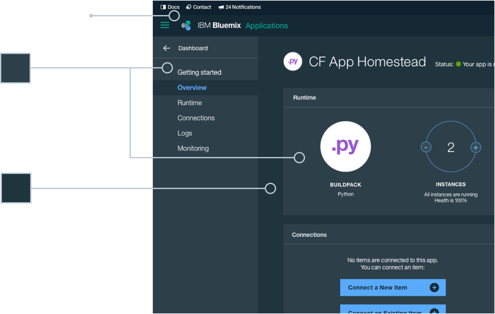
Dark UI Color Scheme
-
Copy HEX
IBM Blue 20
#7cc7ff
$color__blue-20
-
Copy HEX
IBM Blue 30
#5aaafa
$color__blue-30
-
Copy HEX
IBM Blue 40
#5596e6
$color__blue-40
-
Copy HEX
IBM Blue 50
#4178be
$color__blue-50
-
Copy HEX
Navy-Gray 3
#2d3f49
$color__navy-gray-3
-
Copy HEX
Navy-Gray 2
#20343e
$color__navy-gray-2
-
Copy HEX
IBM Blue 90
#152935
$color__blue-90
-
Copy HEX
Navy-Gray 1
#0f212e
$color__navy-gray-1
-
Copy HEX
Navy-Gray 7
#8c9ba5
$color__navy-gray-7
-
Copy HEX
Navy-Gray 6
#5a6872
$color__navy-gray-6
-
Copy HEX
Navy-Gray 5
#42535c
$color__navy-gray-5
-
Copy HEX
Navy-Gray 4
#394b54
$color__navy-gray-4
-
Copy HEX
White
#fff
$color__white
-
Copy HEX
Navy-Gray 8
#dfe6eb
$color__navy-gray-8
-
Copy HEX
Navy-Gray 9
#eff2f5
$color__navy-gray-9
Accent Colors
-
Copy HEX
IBM Teal 20
#6eedd8
$color__teal-20
-
Copy HEX
IBM Teal 30
#41d6c3
$color__teal-30
-
Copy HEX
IBM Teal 40
#00b4a0
$color__teal-40
-
Copy HEX
IBM Green 30
#8cd211
$color__green-30
-
Copy HEX
IBM Yellow 30
#efc100
$color__yellow-30
-
Copy HEX
IBM Orange 30
#ff7832
$color__orange-30
-
Copy HEX
IBM Red 40
#ff5050
$color__red-40
-
Copy HEX
IBM Red 50
#e71d32
$color__red-50
-
Copy HEX
IBM Purple 40
#af6ee8
$color__purple-40
Color Contrast | 4.5 : 1 Ratio
All type color combinations on Bluemix must pass WCAG AA standards of 4.5 : 1. In the table below are approved color combinations.
-
Normal Text
-
Large Text: 18px bold or larger
-
Dark Background Colors:
-

Navy-Gray 3
#2d4f49 -

Navy-Gray 2
#20343e -

IBM Blue 90
#152934 -

Navy-Gray 1
#0f212e
Type Colors:
-
White
#ffffff -
Navy-Gray 8
#dfe6eb -
IBM Blue 20
#7cc7ff -
IBM Blue 30
#5aaafa
-
-
Other Background Colors:
-

White
#ffffff -

Navy-Gray 8
#dfe6eb -

IBM Blue 30
#5aaafa -

IBM Blue 40
#5596e6
Type Colors:
-
IBM Blue 90
#152934 -
Navy-Gray 5
#42535c -
IBM Blue 40
#5596e6 -
IBM Blue 50
#4178be
-
Dark UI Color Usage
The base background color for Dark UI is Navy-Gray 2. The global header is the uniting element between the Dark and Light UI themes, and therefore remains dark and does not change between the two themes. Type and other components can live either on the base Navy-Gray 2 or on a layered Navy-Gray 3 module or layer.
-
Unchanged Global
Dark UI Header -
Layer 2
Navy-Gray 3
#2d3f49
Added layer or module
background color -
Layer 1
Navy-Gray 2
#20343e
Base background color