See a problem with the code? Need a new component? Have feedback? We'd love to hear it all! The success of the Bluemix Design System relies on great people like yourself. Fill out the form below to submit your issue to our GitHub repo.
A member of the Bluemix Design System's team will be in touch within 48 hours.
Thank you!
Your issue, , is now in the bluemix-components repo. Click the issue number
to track the progress or make edits to your issue.
We will get back to you within 48 hours. Feel free to reach out to us on one of our slack channels if you have additional questions:
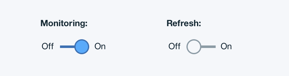
Toggles are used for binary actions that occur immediately after the user “flips” the toggle switch. They are commonly used for “On/Off” situations.
Example:
Titles
A title may accompany a toggle to further clarify the action the toggle will perform.
Labels
Use labels with a toggle so the action of the toggle is clear. Labels should be 3 words or less and appear on both sides of a toggle.
Language
Use adjectives rather than verbs to describe labels and the state of the object affected.
Example
Structure
Basics
Toggles have two states: action on and action off. When an action state is on, the toggle button should be solid and on the right end of the toggle bar. When an action state is off, the button should have a 2px border with no fill and be on the left end of the toggle bar. The font for the inactive state should be lighter than the active state.
Toggle | units in px / rem
Toggle | units in px / rem
PROPERTY
PX
REM
Height & width
24
2.5
Button border
2
0.125
Toggle slider
24
2.5
COLOR
HEX
SCSS VARIABLE
Non-selected state fill
#20343e
$color__navy-gray-2
Non-selected state stroke
#8c9ba5
$color__navy-gray-7
Selected state fill
#5aaafa
$color__blue-30
Selected state stroke
#3d70b2
$color__blue-51
COLOR
HEX
SCSS VARIABLE
Non-selected state fill
#f5f7fa
$color__navy-gray-3
Non-selected state stroke
#8c9ba5
$color__navy-gray-7
Selected state fill
#5aaafa
$color__blue-30
Selected state stroke
#3d70b2
$color__blue-51
Typography
Toggle headings and labels should be set in sentence case, with only the first word in a phrase and any proper nouns capitalized, and no more than 3 words. Toggle text should follow the typography font stack for sans-serif.
FONT-SIZE
PX
REM
Text
14
.875
FONT WEIGHT
KEYWORD
NUMERICAL VALUE
Text
Normal
400
Padding
Toggles cannot have any element or text within 16 pixels / 1rem of its borders.