See a problem with the code? Need a new component? Have feedback? We'd love to hear it all! The success of the Bluemix Design System relies on great people like yourself. Fill out the form below to submit your issue to our GitHub repo.
A member of the Bluemix Design System's team will be in touch within 48 hours.
Thank you!
Your issue, , is now in the bluemix-components repo. Click the issue number
to track the progress or make edits to your issue.
We will get back to you within 48 hours. Feel free to reach out to us on one of our slack channels if you have additional questions:
<input disabled id='unique-radio-disabled' class='bx--radio' type='radio' value='blue' name='radio'>
  <label for='unique-radio-disabled' class='bx--radio__label'>
  <span class='bx--radio__appearance'></span>
  Radio label text - disabled
  </label>
Headings
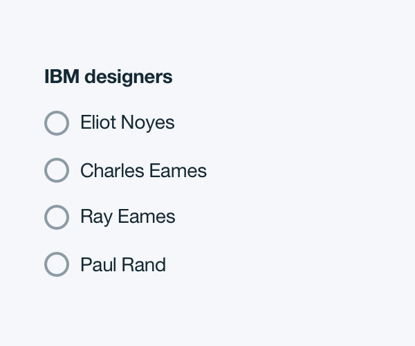
If necessary, a heading can accompany a set of radio buttons to provide further clarity for the user. Use sentence-style capitalization (only the first word in a phrase and any proper nouns capitalized).
Example of a heading within a radio button set:
Labels
Always use a clear and concise label for radio buttons. Be explicit about the action that will follow if the radio button is selected. Labels appear to the right of radio buttons. Use sentence-style capitalization (only the first word in a phrase and any proper nouns capitalized) and no more than 3 words.
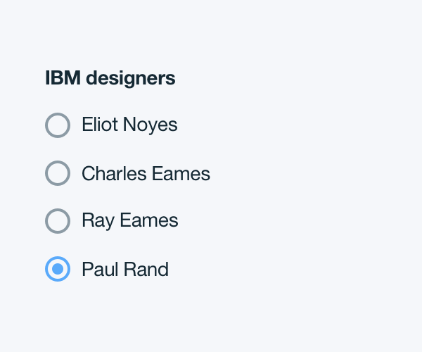
Default selection
A set of radio buttons should default to having one option selected. Never display them without a default selection.
Default selection on a set of radio buttons:
Structure
Basics
Radio buttons have two states, selected and unselected. Selected buttons are filled by a small, solid dot encircled by a 2px border. The dot and border should be the same color. Unselected buttons have a 2px border with no fill.
Radio button | units in px / rem
Radio button | units in px / rem
PROPERTY
PX
REM
Height and width
16
1
Border
2
-
Smaller fill dot height and width
8
0.5
COLOR
HEX
SCSS VARIABLE
Non-selected state border
#8c9ba5
$color__navy-gray-7
Selected state
#5aaafa
$color__blue-30
COLOR
HEX
SCSS VARIABLE
Non-selected state border
#8c9ba5
$color__navy-gray-7
Selected state
#5aaafa
$color__blue-30
Padding
Radio buttons cannot have any element or text within 16 pixels of its borders.
There should be 16px / 1rem between the radio button and the radio button label text.
Radio button padding | units in px / rem
Radio button padding | units in px / rem
PROPERTY
PX
REM
External padding
16
1
Padding between label and button
16
1
Typography
Number input labels should be set in bold and sentence case, with only the first word in a phrase and any proper nouns capitalized. Number input text should be set in roman and only contain numbers, no letters. All number input type should follow the typography font stack for sans-serif.