See a problem with the code? Need a new component? Have feedback? We'd love to hear it all! The success of the Bluemix Design System relies on great people like yourself. Fill out the form below to submit your issue to our GitHub repo.
A member of the Bluemix Design System's team will be in touch within 48 hours.
Thank you!
Your issue, , is now in the bluemix-components repo. Click the issue number
to track the progress or make edits to your issue.
We will get back to you within 48 hours. Feel free to reach out to us on one of our slack channels if you have additional questions:
Progress Indicator are a visual representation of a users progress through a set of steps. They guide the user through a number of steps in order to complete a specified process.
Use progress indicators to keep the user on track when completing a specific task. By dividing the end goal into smaller, sub-tasks, it increases the percentage of completeness as each task is completed.
Best practices
Logical progression
Display the steps in order from left to right. Indicate to the user that they are performing a multi-step process, and show the direction of movement. Allow the user to return to a previous step to review their data submission.
Indicate the current step
Keeping the user informed of where they currently are within the process or task at hand will give them a sense of control. This helps the user to know where they are in relation to where they have been, and what sections are to follow. Clear labels should accompany the progress indicator to indicate what the user will accomplish within each step. Keep labels between 1-2 words.
Validation
Use validation to confirm that a previous step has been completed. If the user cannot proceed onto another step without first completing a task, use an inline notification to inform them.
Structure
Basics
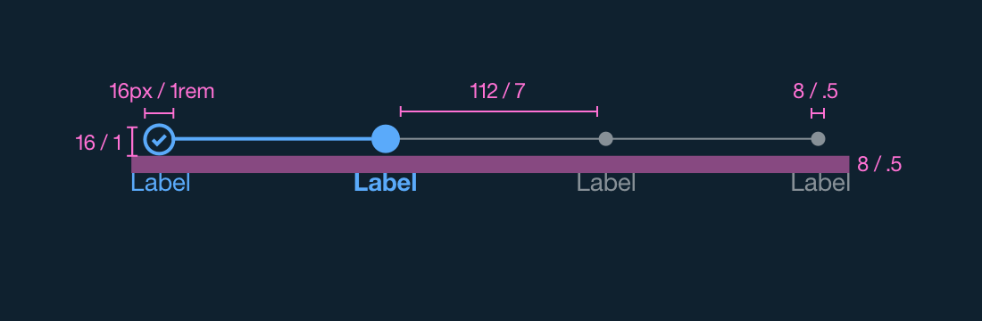
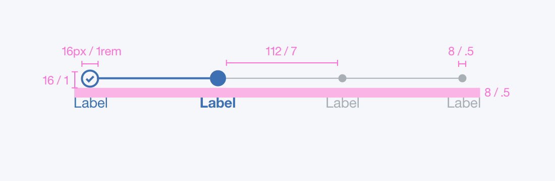
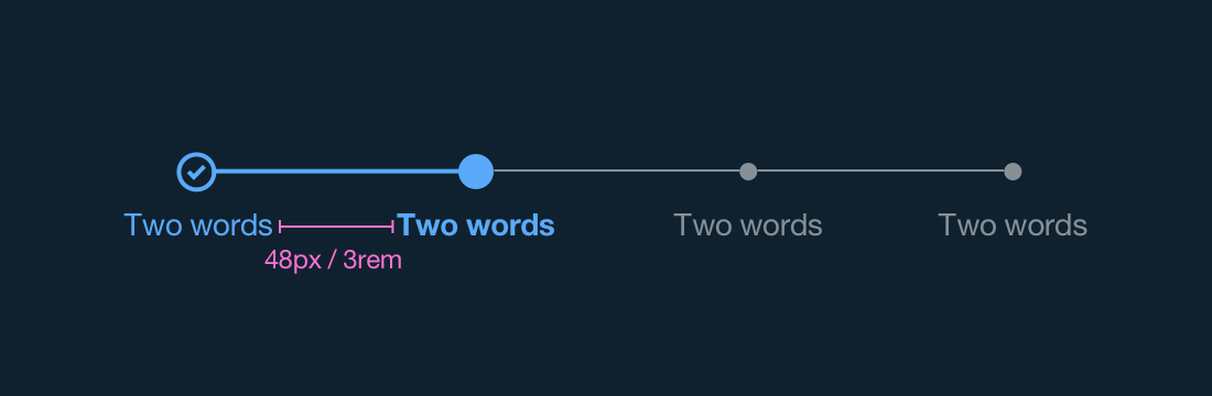
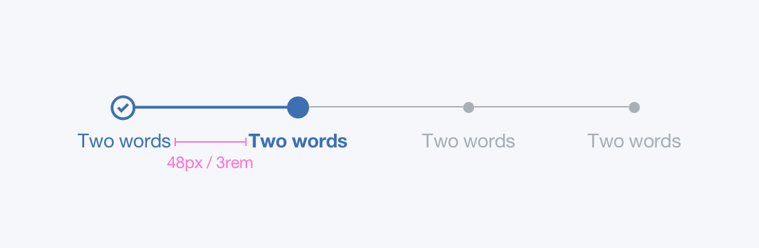
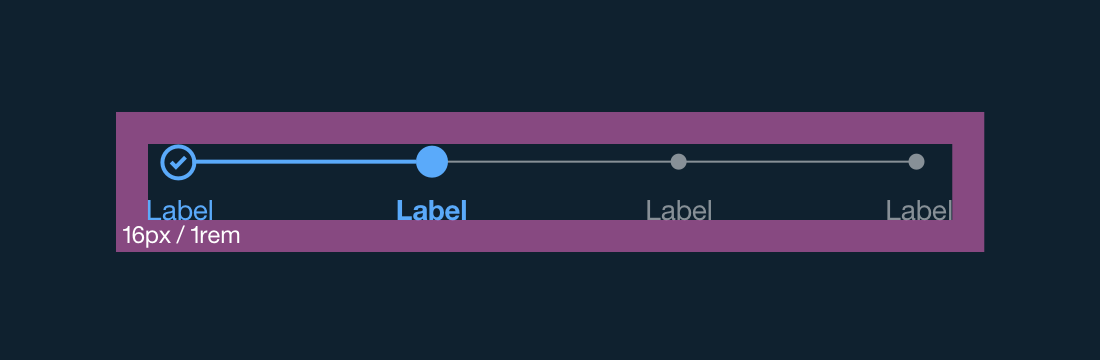
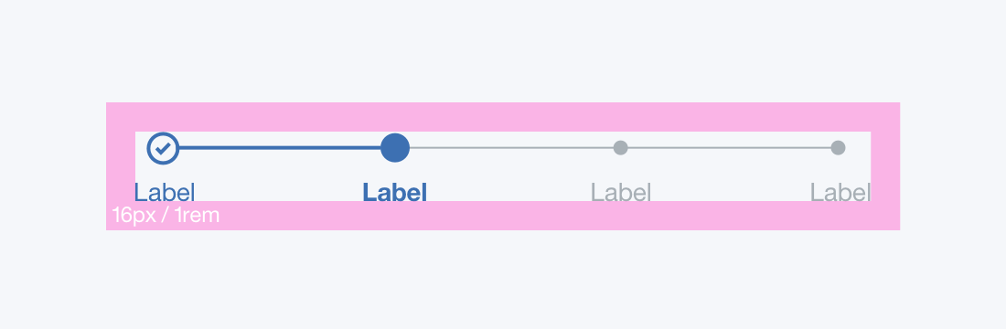
The progress indicator is used to inform the user what step they are on in a series of steps to complete a larger action. All steps that have already been completed are indicated by an outlined circle with a checkmark. The checkmark icon can be found in the Icon Repo or on the Iconography Library page. The current step the user is on is indicated by a filled circle. Steps the user has not encountered yet, or future steps, are indicated by a smaller, single color fill circle.
PROPERTY
PX
REM
Space between steps (minimum)
48
3
Large circle height and width
16
1
Small circle height & width
8
0.5
WEIGHT
PX
REM
Large circle outline weight
2
Line between completed steps
2
Line between completed step & future step
2
COLOR
HEX
SCSS VARIABLE
Large circle
#5aaafa
$color__blue-30
Small circle @ 50% opacity
#ffffff
$color__white
Line between completed step & future step @ 50% opacity
#5aaafa
$color__blue-30
COLOR
HEX
SCSS VARIABLE
Large circle
#3d70b2
$color__blue-30
Small circle @ 50% opacity
#5a6872
$color__blue-51
Line between completed step & future step @ 50% opacity
#3d70b2
$color__blue-30
There are a few distinguishing rules that seperate a progress indicator on desktop from one on mobile.
Desktop
A progress indicator only appears horizontally on a desktop, above the content that it is changing. The line that connects the current step to the next future step should be 1px and take on the color of the future step circle.
Progress indicator | units in px / rem
Progress indicator | units in px / rem
Progress indicator with two words | units in px / rem
Progress indicator with two words | units in px / rem
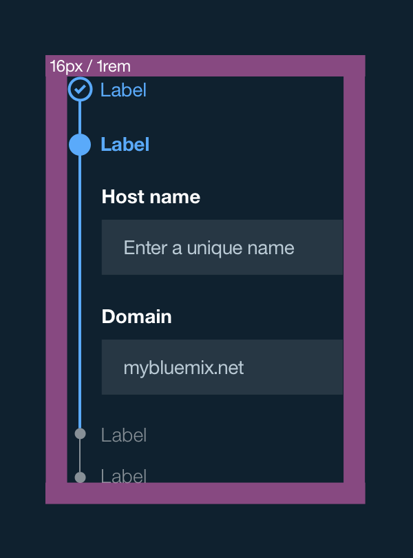
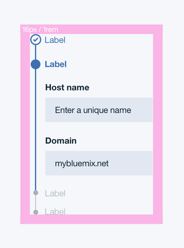
Mobile
A progress indicator appears vertically on mobile, to the left of the content. The current step expands open revealing its content, while all other steps are closed with the content hidden. The line that connects the current step to next future step should be 2px and take on the color of the current step circle.
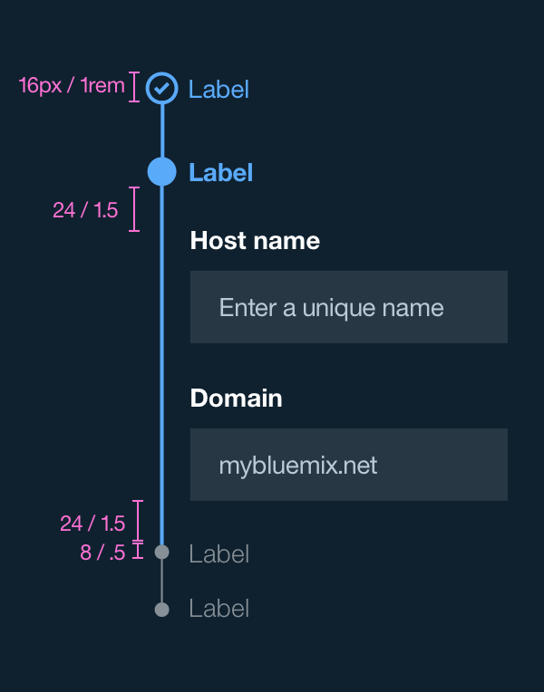
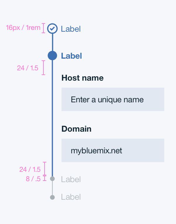
Mobile progress indicator | units in px / rem
Mobile progress indicator | units in px / rem
Mobile progress indicator | units in px / rem
Mobile progress indicator | units in px / rem
Padding
A progress indicator cannot have any element or text within 16 pixels / 1 em of its borders. There should be 8px / .5 em of space between the progress indicator bar and the labels.
PROPERTY
PX
REM
Padding between circles and labels
8
0.5
Progress indicator internal padding | units in px / rem
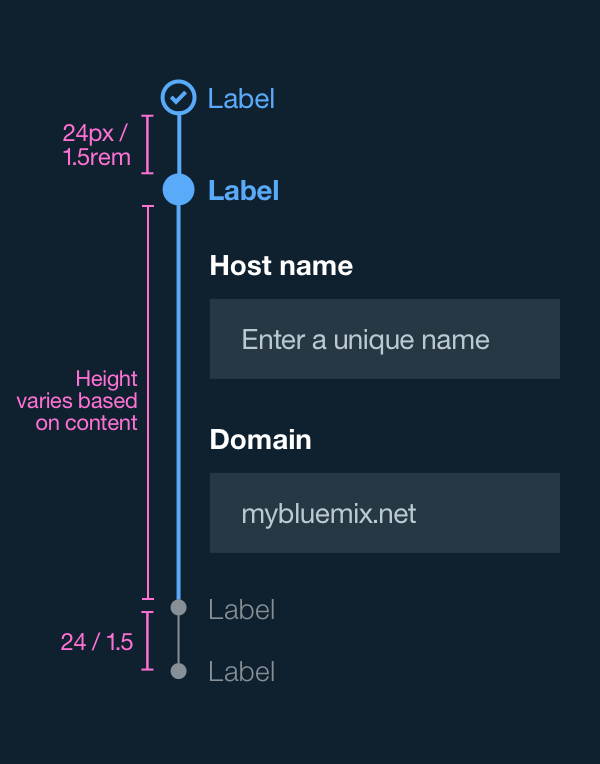
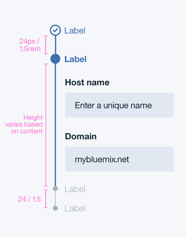
Mobile progress indicator padding | units in px / rem
Mobile progress indicator padding | units in px / rem
Mobile progress indicator padding | units in px / rem
Typography
Labels should be one to two words only, with a limit of 16 characters total per label. All labels should be set in title case, with the first letter of every word capitalized. All label text should follow the Typography font stack for san-serif.