components
Modals
Modals communicate information via a secondary window and allow the user to maintain the context of a particular task. Use modals sparingly because they interrupt user workflow.
Variations
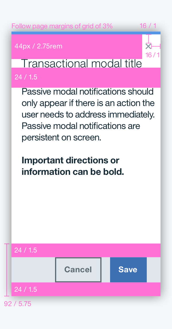
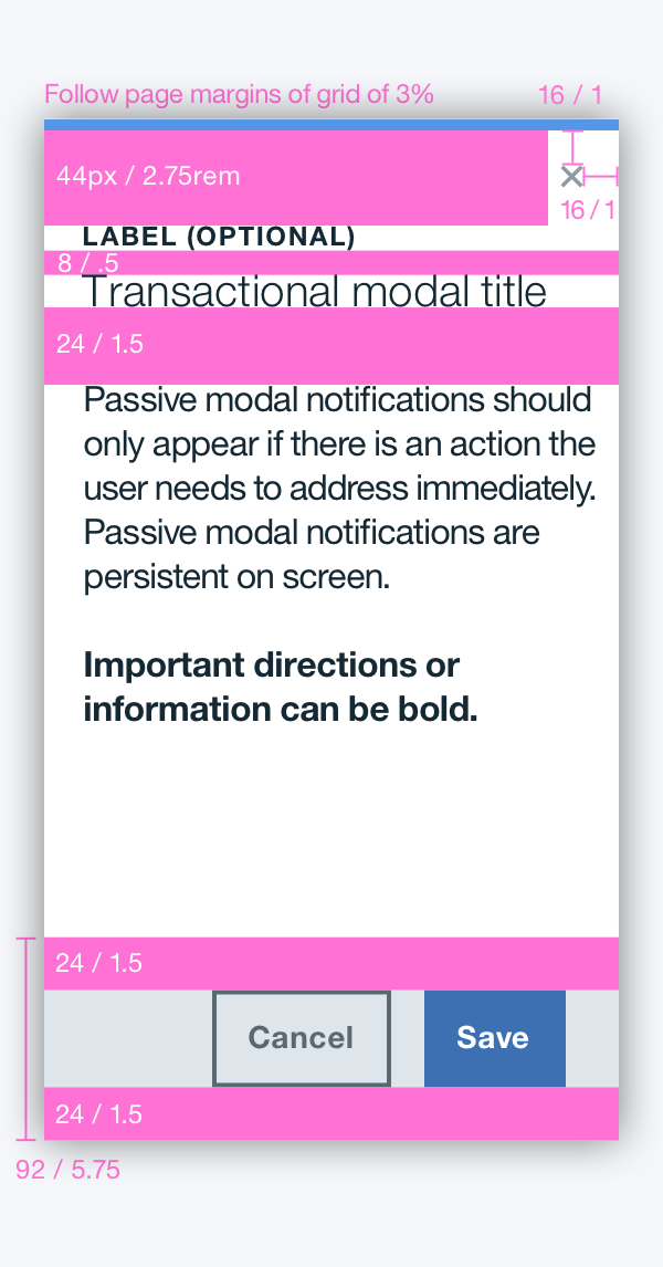
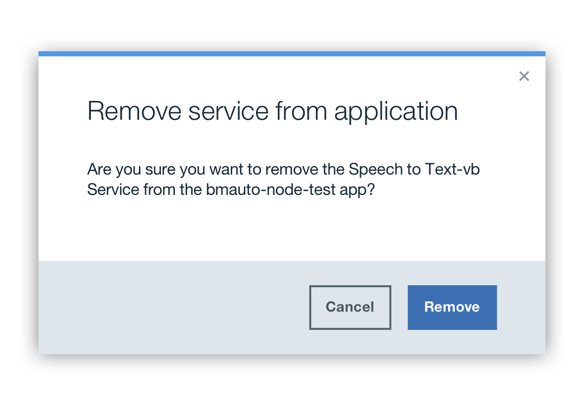
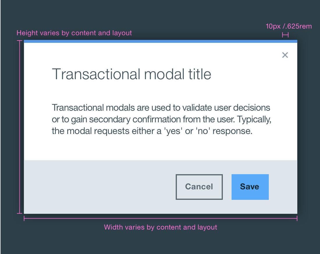
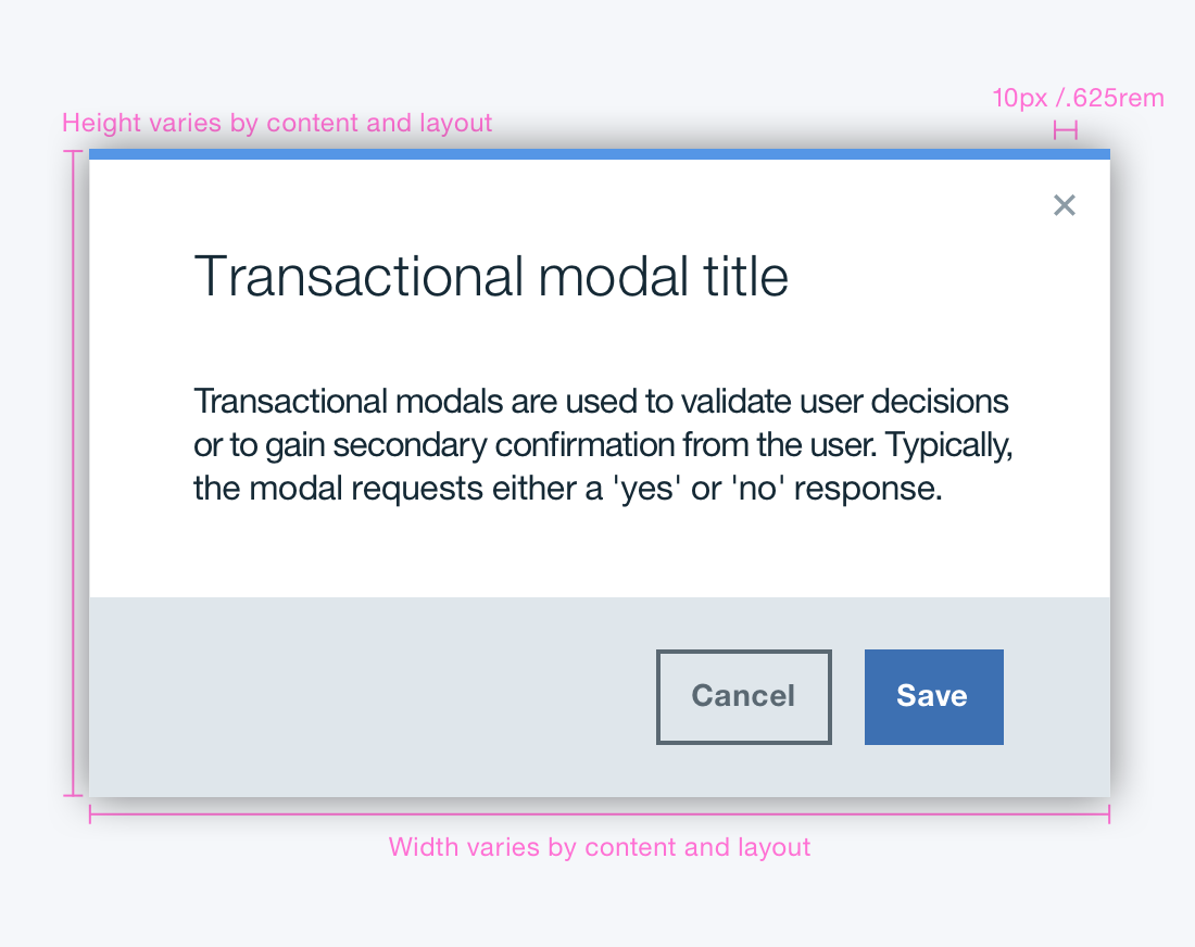
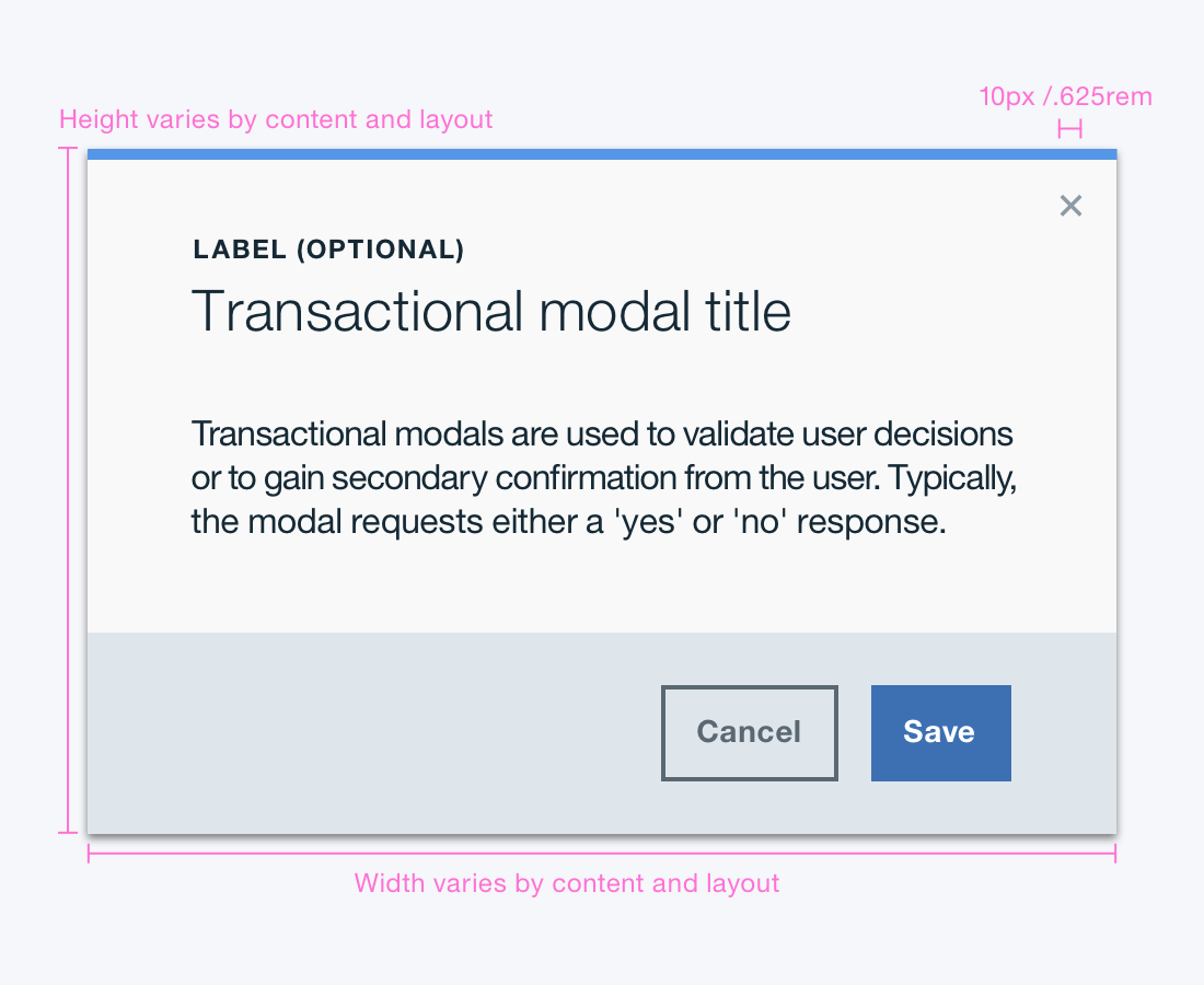
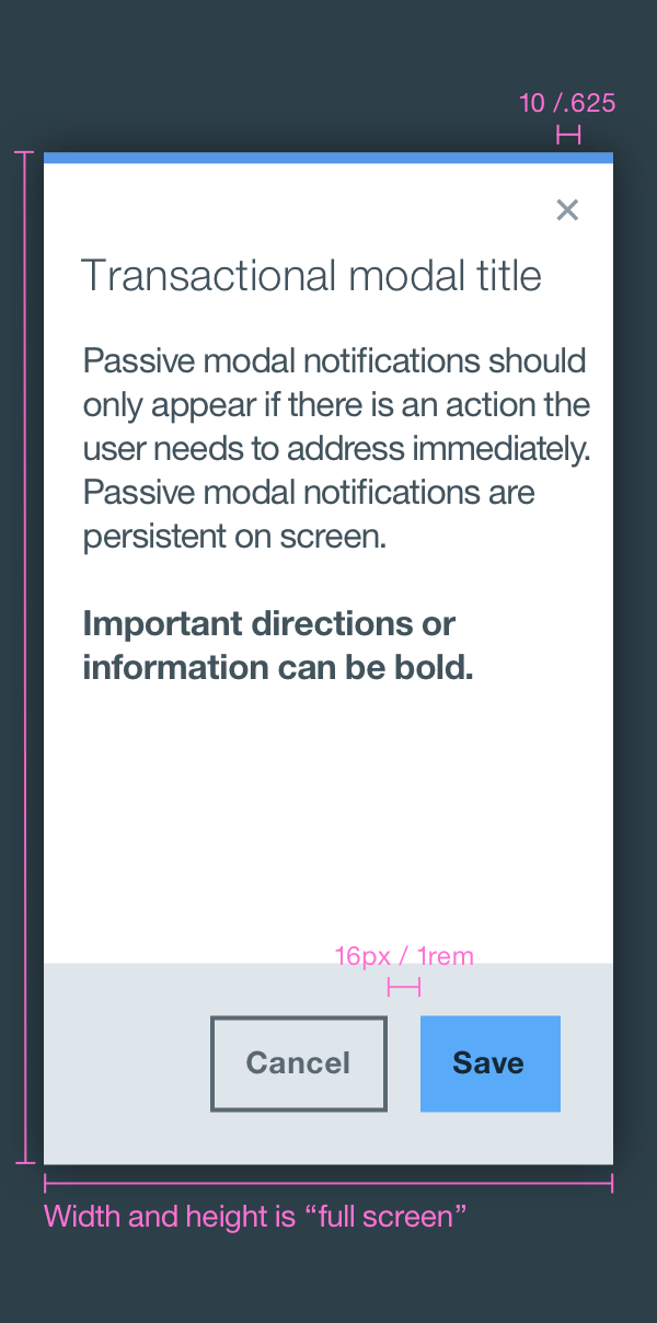
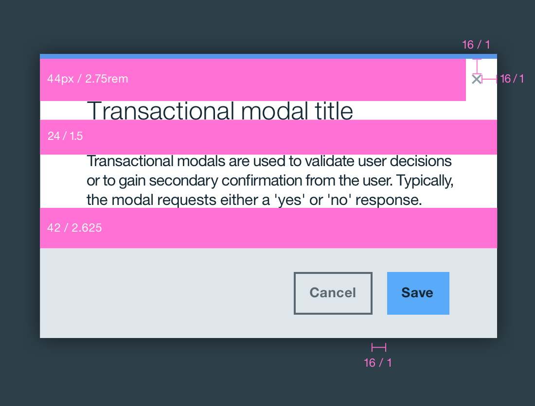
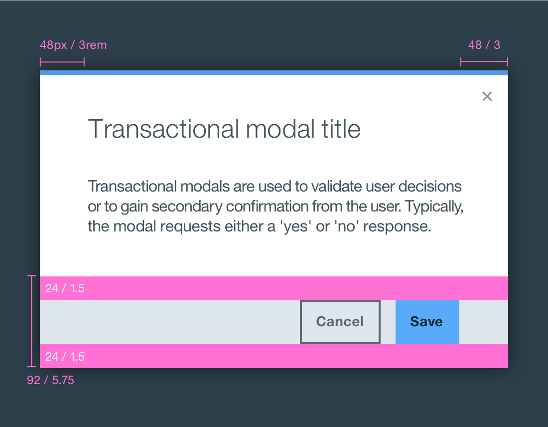
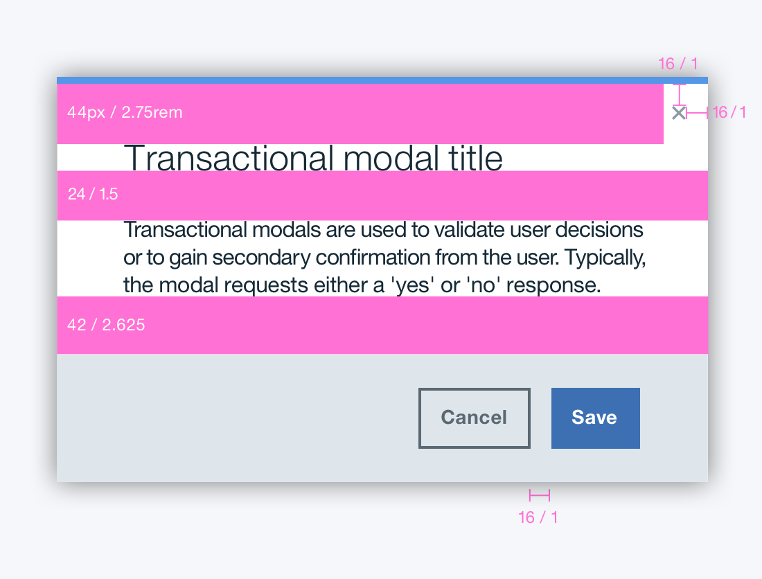
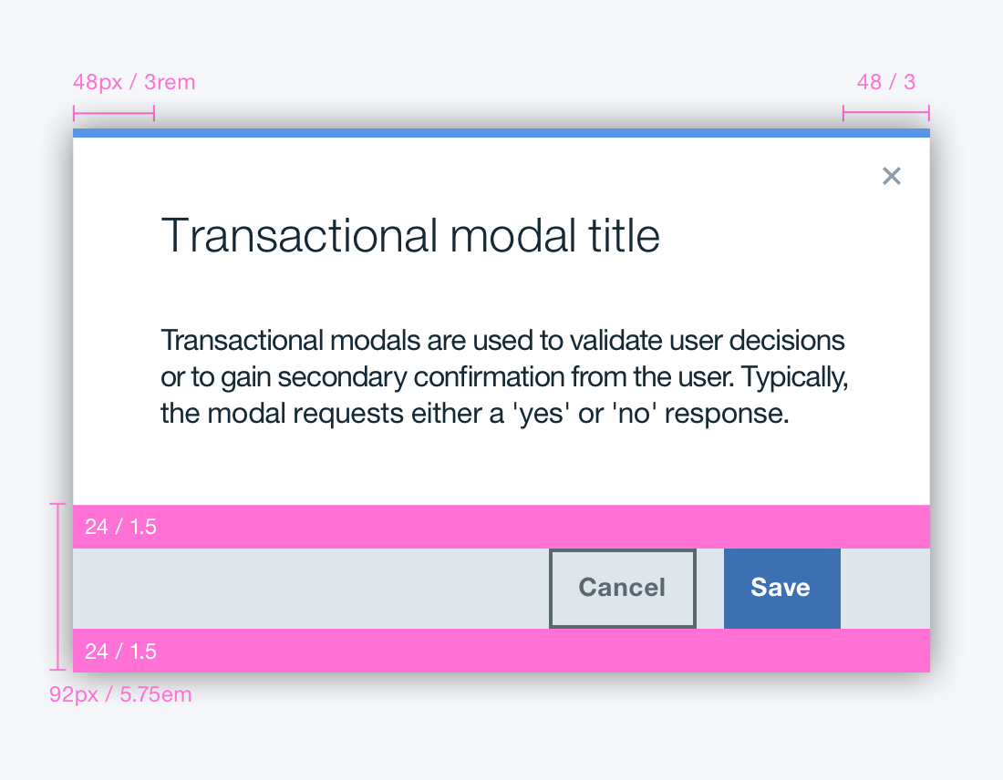
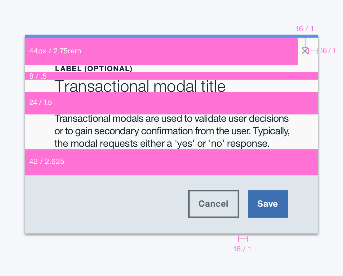
Transactional modal
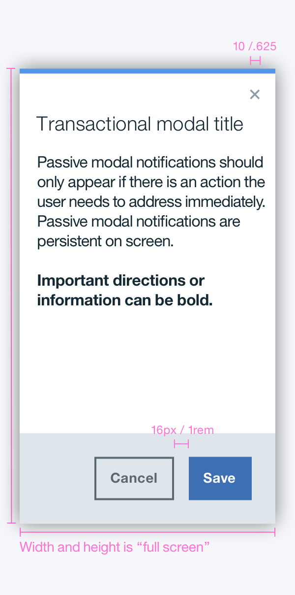
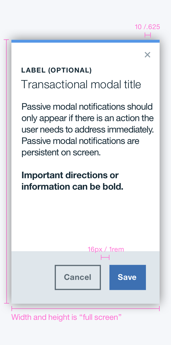
Transactional modals are used to validate user decisions or to gain secondary confirmation from the user. Typically, the modal requests either a 'yes' or 'no' response.
- HTML
- JS
<button class='bx--btn' type='button' data-modal-target='#transactional-modal'>Transactional modal</button>

  <div data-modal id='transactional-modal' class='bx--modal bx--modal-tall' tabindex='-1'>

  <div class='bx--modal-inner'>

    <h4 class='bx--modal-content__label'>Label (Optional)</h4>
    <h2 class='bx--modal-content__heading'>Tall Transactional Modal</h2>
    <button class='bx--modal__close' type='button' data-modal-close>
      <svg class='bx--modal__close--icon'>
        <use xlink:href='https://dev-console.stage1.ng.bluemix.net/api/v5/img/bluemix-icons.svg#close'></use>
      </svg>
    </button>

    <div class='bx--modal-content'>
      <p class='bx--modal-content__text'>Transactional modals are used to validate user decisions
  or to gain secondary confirmation from the user. Typically,
  the modal requests either a 'yes' or 'no' response.</p>

      <!-- label > input -->
      <label class='bx--checkbox__label'>
        <input class='bx--checkbox bx--checkbox--svg' type='checkbox' value='yellow' name='checkbox'>
        <span class='bx--checkbox__appearance'>
          <svg class='bx--checkbox__checkmark'>
            <use xlink:href='https://dev-console.stage1.ng.bluemix.net/api/v4/img/sprite.svg#support--check-padding'></use>
          </svg>
        </span>
        <span class='bx--checkbox__label-text'>Checkbox SVG (label > input)</span>
      </label>

      <p class='bx--modal-content__text'>This is a really long body of text to test a tall modal CSS. This is a really long body of text to test a tall modal CSS. This is a really long body of text to test a tall modal CSS. This is a really long body of text to test a tall modal CSS. This is a really long body of text to test a tall modal CSS. This is a really long body of text to test a tall modal CSS. This is a really long body of text to test a tall modal CSS. This is a really long body of text to test a tall modal CSS. This is a really long body of text to test a tall modal CSS. This is a really long body of text to test a tall modal CSS. This is a really long body of text to test a tall modal CSS. This is a really long body of text to test a tall modal CSS. This is a really long body of text to test a tall modal CSS. This is a really long body of text to test a tall modal CSS. This is a really long body of text to test a tall modal CSS. This is a really long body of text to test a tall modal CSS. This is a really long body of text to test a tall modal CSS. This is a really long body of text to test a tall modal CSS. This is a really long body of text to test a tall modal CSS. This is a really long body of text to test a tall modal CSS. This is a really long body of text to test a tall modal CSS. This is a really long body of text to test a tall modal CSS. This is a really long body of text to test a tall modal CSS. This is a really long body of text to test a tall modal CSS. This is a really long body of text to test a tall modal CSS. This is a really long body of text to test a tall modal CSS. This is a really long body of text to test a tall modal CSS. This is a really long body of text to test a tall modal CSS. This is a really long body of text to test a tall modal CSS. This is a really long body of text to test a tall modal CSS. This is a really long body of text to test a tall modal CSS. This is a really long body of text to test a tall modal CSS. This is a really long body of text to test a tall modal CSS. This is a really long body of text to test a tall modal CSS. This is a really long body of text to test a tall modal CSS. This is a really long body of text to test a tall modal CSS. This is a really long body of text to test a tall modal CSS. This is a really long body of text to test a tall modal CSS. This is a really long body of text to test a tall modal CSS. This is a really long body of text to test a tall modal CSS. This is a really long body of text to test a tall modal CSS. This is a really long body of text to test a tall modal CSS. This is a really long body of text to test a tall modal CSS. This is a really long body of text to test a tall modal CSS. This is a really long body of text to test a tall modal CSS. This is a really long body of text to test a tall modal CSS. This is a really long body of text to test a tall modal CSS. This is a really long body of text to test a tall modal CSS. This is a really long body of text to test a tall modal CSS</p>
    </div>

    <div class='bx--modal__buttons'>
      <div class='bx--modal__buttons-container'>
        <button class='bx--btn--secondary' type='button' data-modal-close>Cancel</button>
        <button class='bx--btn'>Save</button>
      </div>
    </div>


  </div>

  </div>
import mixin from '../misc/mixin';
  import createComponent from '../mixins/create-component';
  import initComponent from '../mixins/init-component-by-launcher';
  import eventedState from '../mixins/evented-state';
  import '../polyfills/array-from';
  import '../polyfills/element-matches';
  import '../polyfills/object-assign';
  import '../polyfills/custom-event';
  import toggleClass from '../polyfills/toggle-class';

  /**
  * @param {Element} element The element to obtain transition duration from.
  * @returns {number} The transition duration of the given property set in the given element.
  */
  function getTransitionDuration(element) {
  const computedStyle = element.ownerDocument.defaultView.getComputedStyle(element);
  const durations = computedStyle.transitionDuration.split(/,\s*/)
    .map(transitionDuration => parseFloat(transitionDuration))
    .filter(duration => !isNaN(duration));
  return durations.length > 0 ? Math.max(...durations) : 0;
  }

  class Modal extends mixin(createComponent, initComponent, eventedState) {
  /**
   * Modal dialog.
   * @extends CreateComponent
   * @extends InitComponentByLauncher
   * @extends EventedState
   * @param {HTMLElement} element The element working as a modal dialog.
   * @param {Object} [options] The component options.
   * @param {string} [options.classVisible] The CSS class for the visible state.
   * @param {string} [options.classNoScroll] The CSS class for hiding scroll bar in body element while modal is shown.
   * @param {string} [options.eventBeforeShown]
   *   The name of the custom event fired before this modal is shown.
   *   Cancellation of this event stops showing the modal.
   * @param {string} [options.eventAfterShown]
   *   The name of the custom event telling that modal is sure shown
   *   without being canceled by the event handler named by `eventBeforeShown` option (`modal-beingshown`).
   * @param {string} [options.eventBeforeHidden]
   *   The name of the custom event fired before this modal is hidden.
   *   Cancellation of this event stops hiding the modal.
   * @param {string} [options.eventAfterHidden]
   *   The name of the custom event telling that modal is sure hidden
   *   without being canceled by the event handler named by `eventBeforeHidden` option (`modal-beinghidden`).
   */
  constructor(element, options) {
    super(element, options);
    this.hookCloseActions();
  }

  /**
   * A method called when this widget is created upon clicking on launcher button.
   * @param {Event} event The event triggering the creation.
   */
  createdByLauncher(event) {
    this.show(event, (error, shownAlready) => {
      if (!error && !shownAlready && this.element.offsetWidth > 0 && this.element.offsetHeight > 0) {
        this.element.focus();
      }
    });
  }

  /**
   * Adds event listeners for closing this dialog.
   */
  hookCloseActions() {
    this.element.addEventListener('click', (event) => {
      if (event.currentTarget === event.target) this.hide(event);
    });

    if (this.keydownHandler) {
      this.element.ownerDocument.body.removeEventListener('keydown', this.keydownHandler);
      this.keydownHandler = null;
    }

    this.keydownHandler = (event) => {
      if (event.which === 27) {
        this.hide(event);
      }
    };

    this.element.ownerDocument.body.addEventListener('keydown', this.keydownHandler);

    [...this.element.querySelectorAll('[data-modal-close]')].forEach((element) => {
      element.addEventListener('click', (event) => {
        this.hide(event);
      });
    });
  }

  /**
   * @param {string} state The new state.
   * @returns {boolean} `true` of the current state is different from the given new state.
   */
  shouldStateBeChanged(state) {
    return state !== (this.element.classList.contains(this.options.classVisible) ? 'shown' : 'hidden');
  }

  /**
   * Changes the shown/hidden state.
   * @private
   * @param {string} state The new state.
   * @param {Object} detail The detail of the event trigging this action.
   * @param {Function} callback Callback called when change in state completes.
   */
  _changeState(state, detail, callback) {
    let finished;
    const finishedTransition = () => {
      if (!finished) {
        finished = true;
        this.element.removeEventListener('transitionend', finishedTransition);
        callback();
      }
    };
    const visible = state === 'shown';

    this.element.addEventListener('transitionend', finishedTransition);
    const transitionDuration = getTransitionDuration(this.element);
    toggleClass(this.element, this.options.classVisible, visible);
    toggleClass(this.element.ownerDocument.body, this.options.classNoScroll, visible);
    if (transitionDuration === 0) {
      finishedTransition();
    }
  }

  /**
   * Shows this modal dialog.
   * @param {HTMLElement} [launchingElement] The DOM element that triggered calling this function.
   * @param {EventedState~changeStateCallback} [callback] The callback called once showing this dialog is finished or is canceled.
   */
  show(launchingElementOrEvent, callback) {
    const launchingElementOrEventOmitted = !launchingElementOrEvent || typeof launchingElementOrEvent === 'function';
    if (launchingElementOrEventOmitted) {
      callback = launchingElementOrEvent; // eslint-disable-line no-param-reassign
    }

    const launchingElement = launchingElementOrEventOmitted ? null :
      launchingElementOrEvent.delegateTarget || launchingElementOrEvent.currentTarget || launchingElementOrEvent;

    const launchingEvent = launchingElementOrEventOmitted ? null :
      launchingElementOrEvent.currentTarget && launchingElementOrEvent;

    if (launchingElement && !launchingElement.nodeType) {
      throw new TypeError('DOM Node should be given for launching element.');
    }

    if (launchingEvent && !launchingEvent.type) {
      throw new TypeError('DOM event should be given for launching event.');
    }

    this.changeState('shown', { launchingElement, launchingEvent }, callback);
  }

  /**
   * Hides this modal dialog.
   * @param {EventedState~changeStateCallback} [callback] The callback called once showing this dialog is finished or is canceled.
   */
  hide(launchingElementOrEvent, callback) {
    const launchingElementOrEventOmitted = !launchingElementOrEvent || typeof launchingElementOrEvent === 'function';
    if (launchingElementOrEventOmitted) {
      callback = launchingElementOrEvent; // eslint-disable-line no-param-reassign
    }

    const launchingElement = launchingElementOrEventOmitted ? null :
      launchingElementOrEvent.currentTarget || launchingElementOrEvent;

    const launchingEvent = launchingElementOrEventOmitted ? null :
      launchingElementOrEvent.currentTarget && launchingElementOrEvent;

    if (launchingElement && !launchingElement.nodeType) {
      throw new TypeError('DOM Node should be given for launching element.');
    }

    if (launchingEvent && !launchingEvent.type) {
      throw new TypeError('DOM event should be given for launching event.');
    }

    this.changeState('hidden', { launchingElement, launchingEvent }, callback);
  }

  release() {
    if (this.keydownHandler) {
      this.element.ownerDocument.body.removeEventListener('keydown', this.keydownHandler);
      this.keydownHandler = null;
    }
    super.release();
  }

  /**
   * @deprecated
   */
  static hook() {
    console.warn('Modals.hook() is deprecated. Use Modals.init() instead.'); // eslint-disable-line no-console
  }

  /**
   * The map associating DOM element and modal instance.
   * @member Modal.components
   * @type {WeakMap}
   */
  static components = new WeakMap();

  /**
   * The component options.
   * If `options` is specified in the constructor, {@linkcode Modal.create .create()}, or {@linkcode Modal.init .init()},
   * properties in this object are overriden for the instance being create and how {@linkcode Modal.init .init()} works.
   * @member Modal.options
   * @type {Object}
   * @property {string} selectorInit The CSS class to find modal dialogs.
   * @property {string} attribInitTarget The attribute name in the launcher buttons to find target modal dialogs.
   * @property {string} [classVisible] The CSS class for the visible state.
   * @property {string} [classNoScroll] The CSS class for hiding scroll bar in body element while modal is shown.
   * @property {string} [eventBeforeShown]
   *   The name of the custom event fired before this modal is shown.
   *   Cancellation of this event stops showing the modal.
   * @property {string} [eventAfterShown]
   *   The name of the custom event telling that modal is sure shown
   *   without being canceled by the event handler named by `eventBeforeShown` option (`modal-beingshown`).
   * @property {string} [eventBeforeHidden]
   *   The name of the custom event fired before this modal is hidden.
   *   Cancellation of this event stops hiding the modal.
   * @property {string} [eventAfterHidden]
   *   The name of the custom event telling that modal is sure hidden
   *   without being canceled by the event handler named by `eventBeforeHidden` option (`modal-beinghidden`).
   */
  static options = {
    selectorInit: '[data-modal]',
    attribInitTarget: 'data-modal-target',
    classVisible: 'is-visible',
    classNoScroll: 'bx--noscroll',
    eventBeforeShown: 'modal-beingshown',
    eventAfterShown: 'modal-shown',
    eventBeforeHidden: 'modal-beinghidden',
    eventAfterHidden: 'modal-hidden',
    initEventNames: ['click'],
  };
  }

  export default Modal;
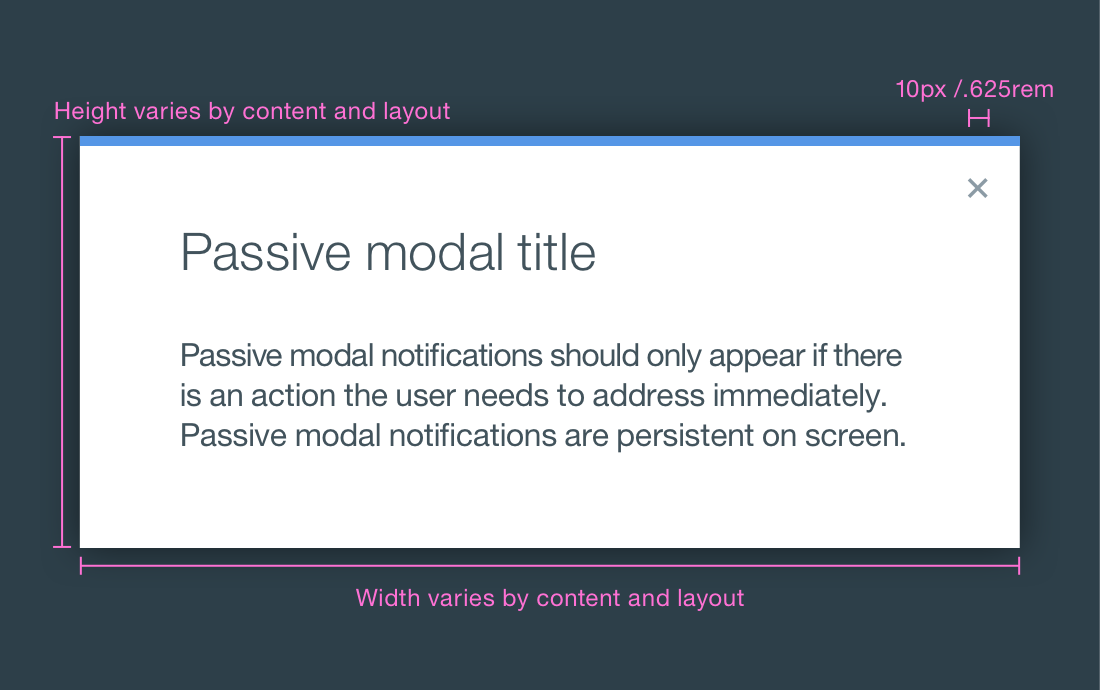
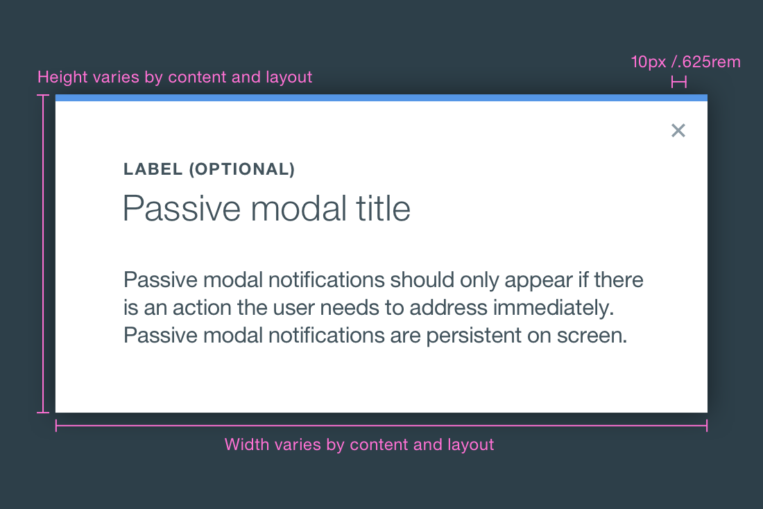
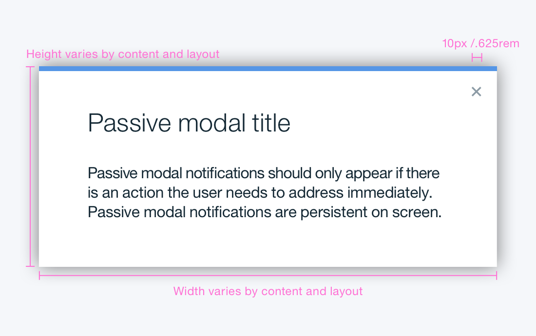
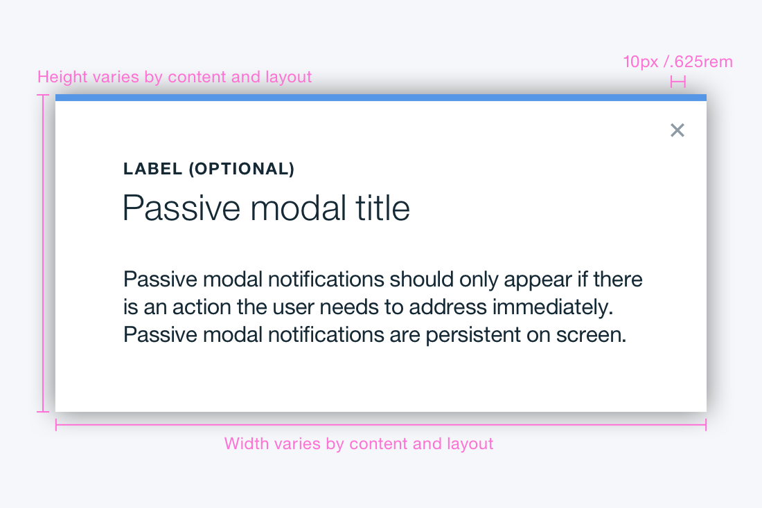
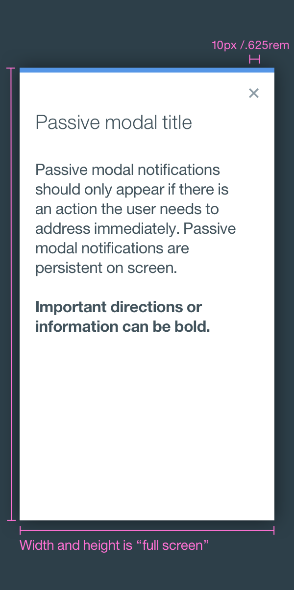
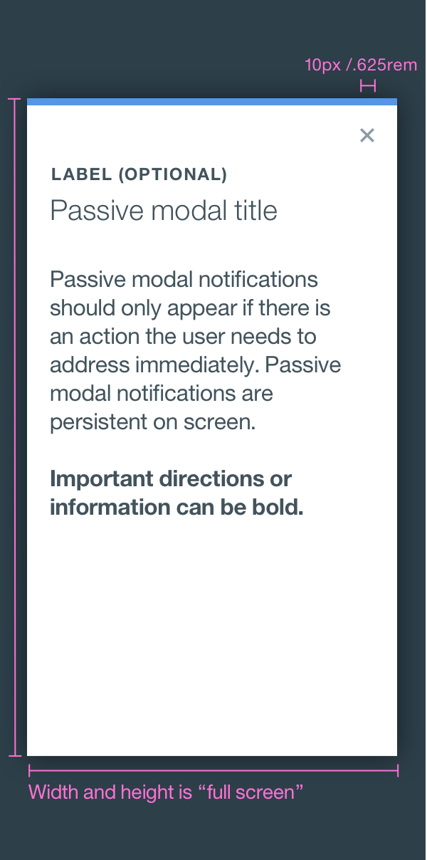
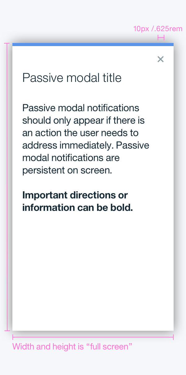
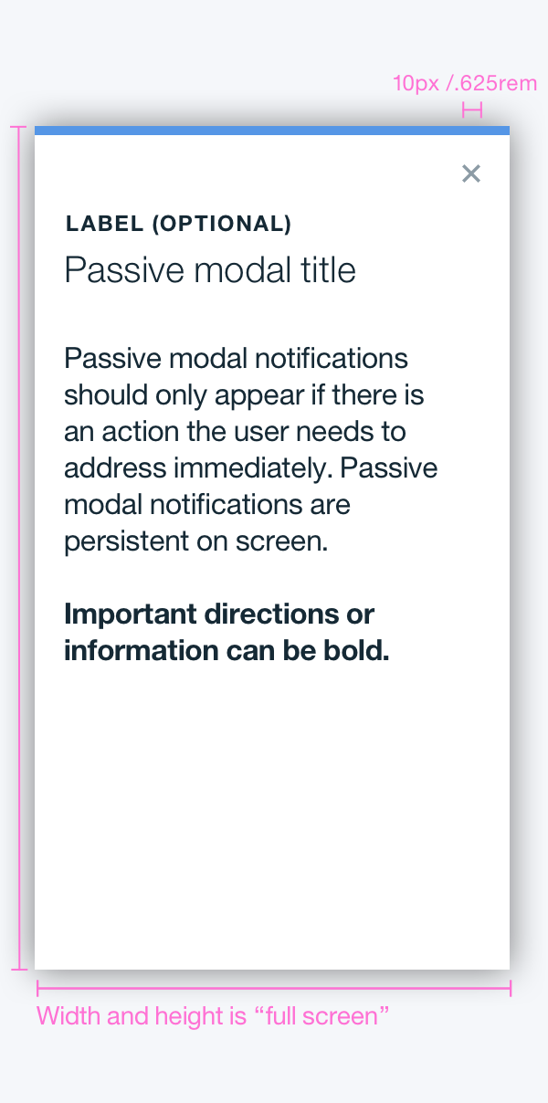
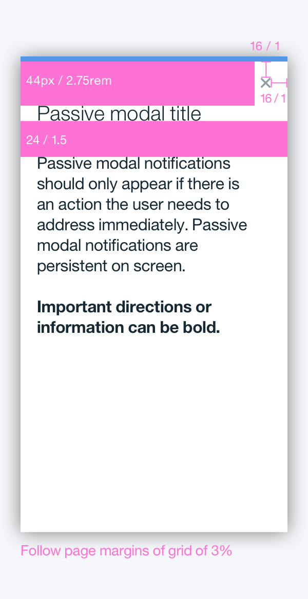
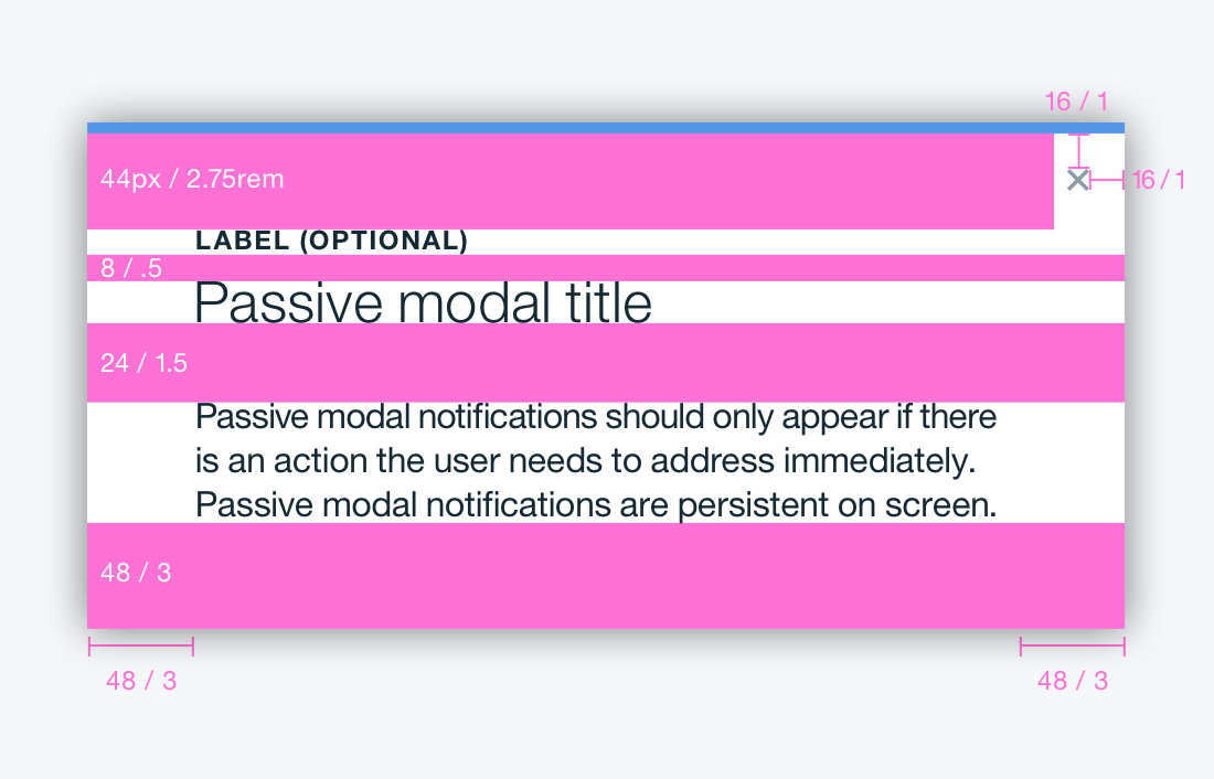
Passive modal
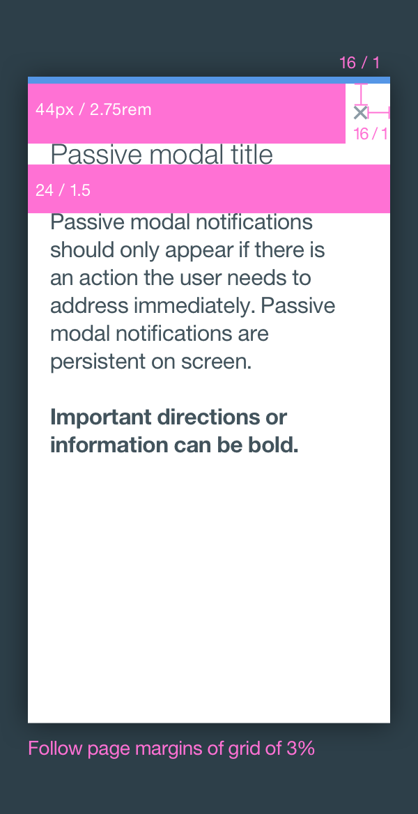
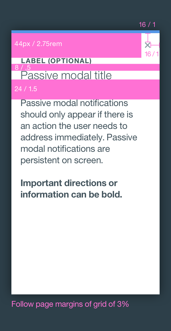
This modal is used as a style of notifications. We highly discourage the use of this, due to its disruptive nature. Passive modal notifications should only appear if there is an action the user needs to address immediately. Passive modal notifications are persistent on-screen. That is, they do not automatically go away after appearing. Users must either engage with or dismiss the notification.
- HTML
- JS
<button class='bx--btn' type='button' data-modal-target='#passive-modal'>Passive modal</button>

  <div data-modal id='passive-modal' class='bx--modal' tabindex='-1'>
  <div class='bx--modal-inner'>
    <div class='bx--modal-content'>
      <div class='bx--modal__header'>
        <button class='bx--modal__close' type='button' data-modal-close>
          <svg class='bx--modal__close--icon'>
            <use xlink:href='https://dev-console.stage1.ng.bluemix.net/api/v5/img/bluemix-icons.svg#close'></use>
          </svg>
        </button>
        <h4 class='bx--modal-content__label'>Label (Optional)</h4>
        <h2 class='bx--modal-content__heading'>Passive Modal Title</h2>
      </div>
      <p class='bx--modal-content__text'>
        Passive modal notifications should only appear if there
  is an action the user needs to address immediately.
        Passive modal notifications are persistent on screen.
      </p>
    </div>
  </div>
  </div>
import mixin from '../misc/mixin';
  import createComponent from '../mixins/create-component';
  import initComponent from '../mixins/init-component-by-launcher';
  import eventedState from '../mixins/evented-state';
  import '../polyfills/array-from';
  import '../polyfills/element-matches';
  import '../polyfills/object-assign';
  import '../polyfills/custom-event';
  import toggleClass from '../polyfills/toggle-class';

  /**
  * @param {Element} element The element to obtain transition duration from.
  * @returns {number} The transition duration of the given property set in the given element.
  */
  function getTransitionDuration(element) {
  const computedStyle = element.ownerDocument.defaultView.getComputedStyle(element);
  const durations = computedStyle.transitionDuration.split(/,\s*/)
    .map(transitionDuration => parseFloat(transitionDuration))
    .filter(duration => !isNaN(duration));
  return durations.length > 0 ? Math.max(...durations) : 0;
  }

  class Modal extends mixin(createComponent, initComponent, eventedState) {
  /**
   * Modal dialog.
   * @extends CreateComponent
   * @extends InitComponentByLauncher
   * @extends EventedState
   * @param {HTMLElement} element The element working as a modal dialog.
   * @param {Object} [options] The component options.
   * @param {string} [options.classVisible] The CSS class for the visible state.
   * @param {string} [options.classNoScroll] The CSS class for hiding scroll bar in body element while modal is shown.
   * @param {string} [options.eventBeforeShown]
   *   The name of the custom event fired before this modal is shown.
   *   Cancellation of this event stops showing the modal.
   * @param {string} [options.eventAfterShown]
   *   The name of the custom event telling that modal is sure shown
   *   without being canceled by the event handler named by `eventBeforeShown` option (`modal-beingshown`).
   * @param {string} [options.eventBeforeHidden]
   *   The name of the custom event fired before this modal is hidden.
   *   Cancellation of this event stops hiding the modal.
   * @param {string} [options.eventAfterHidden]
   *   The name of the custom event telling that modal is sure hidden
   *   without being canceled by the event handler named by `eventBeforeHidden` option (`modal-beinghidden`).
   */
  constructor(element, options) {
    super(element, options);
    this.hookCloseActions();
  }

  /**
   * A method called when this widget is created upon clicking on launcher button.
   * @param {Event} event The event triggering the creation.
   */
  createdByLauncher(event) {
    this.show(event, (error, shownAlready) => {
      if (!error && !shownAlready && this.element.offsetWidth > 0 && this.element.offsetHeight > 0) {
        this.element.focus();
      }
    });
  }

  /**
   * Adds event listeners for closing this dialog.
   */
  hookCloseActions() {
    this.element.addEventListener('click', (event) => {
      if (event.currentTarget === event.target) this.hide(event);
    });

    if (this.keydownHandler) {
      this.element.ownerDocument.body.removeEventListener('keydown', this.keydownHandler);
      this.keydownHandler = null;
    }

    this.keydownHandler = (event) => {
      if (event.which === 27) {
        this.hide(event);
      }
    };

    this.element.ownerDocument.body.addEventListener('keydown', this.keydownHandler);

    [...this.element.querySelectorAll('[data-modal-close]')].forEach((element) => {
      element.addEventListener('click', (event) => {
        this.hide(event);
      });
    });
  }

  /**
   * @param {string} state The new state.
   * @returns {boolean} `true` of the current state is different from the given new state.
   */
  shouldStateBeChanged(state) {
    return state !== (this.element.classList.contains(this.options.classVisible) ? 'shown' : 'hidden');
  }

  /**
   * Changes the shown/hidden state.
   * @private
   * @param {string} state The new state.
   * @param {Object} detail The detail of the event trigging this action.
   * @param {Function} callback Callback called when change in state completes.
   */
  _changeState(state, detail, callback) {
    let finished;
    const finishedTransition = () => {
      if (!finished) {
        finished = true;
        this.element.removeEventListener('transitionend', finishedTransition);
        callback();
      }
    };
    const visible = state === 'shown';

    this.element.addEventListener('transitionend', finishedTransition);
    const transitionDuration = getTransitionDuration(this.element);
    toggleClass(this.element, this.options.classVisible, visible);
    toggleClass(this.element.ownerDocument.body, this.options.classNoScroll, visible);
    if (transitionDuration === 0) {
      finishedTransition();
    }
  }

  /**
   * Shows this modal dialog.
   * @param {HTMLElement} [launchingElement] The DOM element that triggered calling this function.
   * @param {EventedState~changeStateCallback} [callback] The callback called once showing this dialog is finished or is canceled.
   */
  show(launchingElementOrEvent, callback) {
    const launchingElementOrEventOmitted = !launchingElementOrEvent || typeof launchingElementOrEvent === 'function';
    if (launchingElementOrEventOmitted) {
      callback = launchingElementOrEvent; // eslint-disable-line no-param-reassign
    }

    const launchingElement = launchingElementOrEventOmitted ? null :
      launchingElementOrEvent.delegateTarget || launchingElementOrEvent.currentTarget || launchingElementOrEvent;

    const launchingEvent = launchingElementOrEventOmitted ? null :
      launchingElementOrEvent.currentTarget && launchingElementOrEvent;

    if (launchingElement && !launchingElement.nodeType) {
      throw new TypeError('DOM Node should be given for launching element.');
    }

    if (launchingEvent && !launchingEvent.type) {
      throw new TypeError('DOM event should be given for launching event.');
    }

    this.changeState('shown', { launchingElement, launchingEvent }, callback);
  }

  /**
   * Hides this modal dialog.
   * @param {EventedState~changeStateCallback} [callback] The callback called once showing this dialog is finished or is canceled.
   */
  hide(launchingElementOrEvent, callback) {
    const launchingElementOrEventOmitted = !launchingElementOrEvent || typeof launchingElementOrEvent === 'function';
    if (launchingElementOrEventOmitted) {
      callback = launchingElementOrEvent; // eslint-disable-line no-param-reassign
    }

    const launchingElement = launchingElementOrEventOmitted ? null :
      launchingElementOrEvent.currentTarget || launchingElementOrEvent;

    const launchingEvent = launchingElementOrEventOmitted ? null :
      launchingElementOrEvent.currentTarget && launchingElementOrEvent;

    if (launchingElement && !launchingElement.nodeType) {
      throw new TypeError('DOM Node should be given for launching element.');
    }

    if (launchingEvent && !launchingEvent.type) {
      throw new TypeError('DOM event should be given for launching event.');
    }

    this.changeState('hidden', { launchingElement, launchingEvent }, callback);
  }

  release() {
    if (this.keydownHandler) {
      this.element.ownerDocument.body.removeEventListener('keydown', this.keydownHandler);
      this.keydownHandler = null;
    }
    super.release();
  }

  /**
   * @deprecated
   */
  static hook() {
    console.warn('Modals.hook() is deprecated. Use Modals.init() instead.'); // eslint-disable-line no-console
  }

  /**
   * The map associating DOM element and modal instance.
   * @member Modal.components
   * @type {WeakMap}
   */
  static components = new WeakMap();

  /**
   * The component options.
   * If `options` is specified in the constructor, {@linkcode Modal.create .create()}, or {@linkcode Modal.init .init()},
   * properties in this object are overriden for the instance being create and how {@linkcode Modal.init .init()} works.
   * @member Modal.options
   * @type {Object}
   * @property {string} selectorInit The CSS class to find modal dialogs.
   * @property {string} attribInitTarget The attribute name in the launcher buttons to find target modal dialogs.
   * @property {string} [classVisible] The CSS class for the visible state.
   * @property {string} [classNoScroll] The CSS class for hiding scroll bar in body element while modal is shown.
   * @property {string} [eventBeforeShown]
   *   The name of the custom event fired before this modal is shown.
   *   Cancellation of this event stops showing the modal.
   * @property {string} [eventAfterShown]
   *   The name of the custom event telling that modal is sure shown
   *   without being canceled by the event handler named by `eventBeforeShown` option (`modal-beingshown`).
   * @property {string} [eventBeforeHidden]
   *   The name of the custom event fired before this modal is hidden.
   *   Cancellation of this event stops hiding the modal.
   * @property {string} [eventAfterHidden]
   *   The name of the custom event telling that modal is sure hidden
   *   without being canceled by the event handler named by `eventBeforeHidden` option (`modal-beinghidden`).
   */
  static options = {
    selectorInit: '[data-modal]',
    attribInitTarget: 'data-modal-target',
    classVisible: 'is-visible',
    classNoScroll: 'bx--noscroll',
    eventBeforeShown: 'modal-beingshown',
    eventAfterShown: 'modal-shown',
    eventBeforeHidden: 'modal-beinghidden',
    eventAfterHidden: 'modal-hidden',
    initEventNames: ['click'],
  };
  }

  export default Modal;
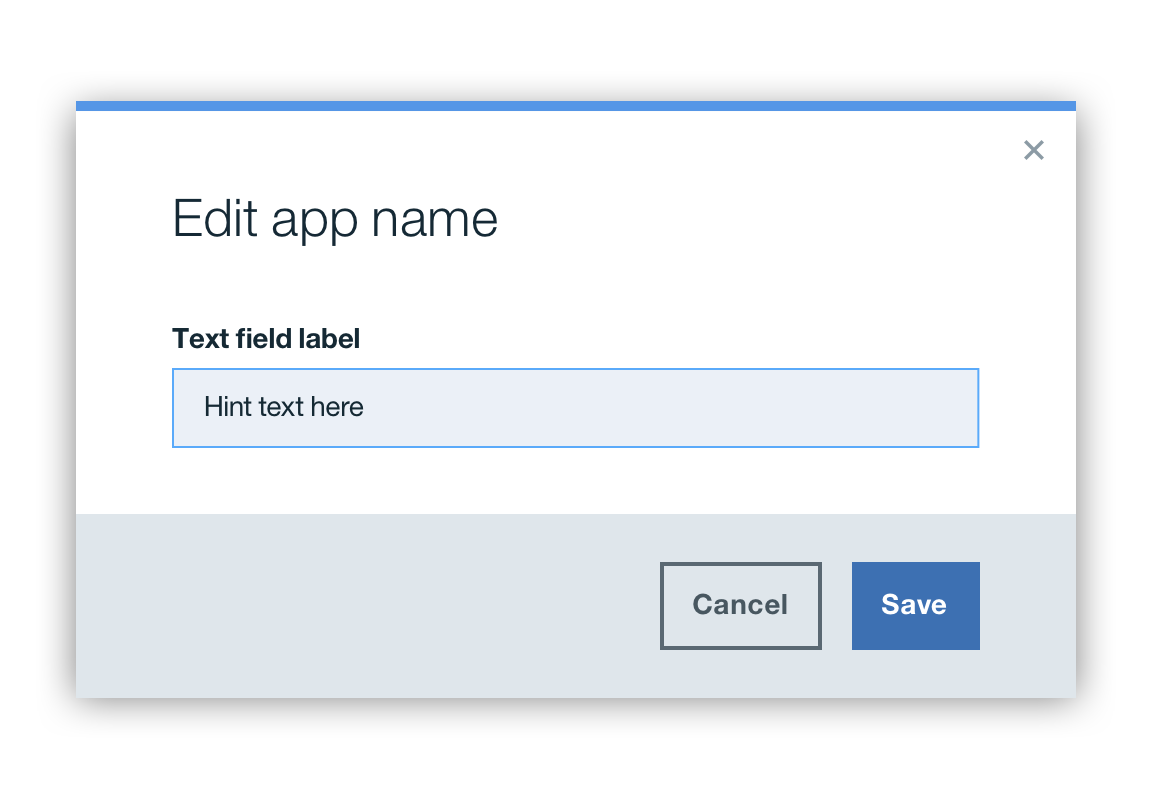
Input modal
Input modals are used to follow up with previous user input. These modals should include areas for input that the user can interact with, such as forms, dropdowns, selectors, and links.
- HTML
- JS
<button class='bx--btn' type='button' data-modal-target='#inputs-modal'>Inputs Modal</button>

  <div data-modal id='inputs-modal' class='bx--modal bx--modal-tall' tabindex='-1'>

  <div class='bx--modal-inner'>

    <h2 class='bx--modal-content__heading'>Modal with Inputs</h2>
    <button class='bx--modal__close' type='button' data-modal-close>
      <svg class='bx--modal__close--icon'>
        <use xlink:href='https://dev-console.stage1.ng.bluemix.net/api/v5/img/bluemix-icons.svg#close'></use>
      </svg>
    </button>

    <div class='bx--modal-content'>

      <label for='modal-text1' class='bx--form__label'>Text Input</label>
      <input id='modal-text1' type='text' class='bx--text__input'>

      <div class='bx--select'>
        <label for='modal-select-id' class='bx--form__label'>Select</label>
        <span class='bx--select__arrow'></span>
        <select id='modal-select-id' class='bx--select__input'>
          <option class='bx--select__option' value='volvo'>Volvo</option>
          <option class='bx--select__option' value='solong'>A much longer option that is worth having around to check how text flows around the background image</option>
          <option class='bx--select__option' value='saab'>Saab</option>
          <option class='bx--select__option' value='opel'>Opel</option>
          <option class='bx--select__option' value='audi'>Audi</option>
        </select>
        <svg class='bx--select__arrow'>
          <use xlink:href='https://dev-console.stage1.ng.bluemix.net/api/v5/img/bluemix-icons.svg#caret--down'></use>
        </svg>
      </div>

      <input id='modal-radio-1' class='bx--radio' type='radio' value='red' name='radio'>
      <label for='modal-radio-1' class='bx--radio__label'>
        <span class='bx--radio__appearance'></span>
        Radio label text 1
      </label>
      <br>
      <input checked id='modal-radio-2' class='bx--radio' type='radio' value='blue' name='radio'>
      <label for='modal-radio-2' class='bx--radio__label'>
        <span class='bx--radio__appearance'></span>
        Radio label text 2
      </label>
      <br>

      <input id='unique-checkbox' class='bx--checkbox bx--checkbox--svg' type='checkbox' value='green' name='checkbox'>
      <label for='unique-checkbox' class='bx--checkbox__label'>
        <span class='bx--checkbox__appearance'>
          <svg class='bx--checkbox__checkmark'>
            <use xlink:href='https://dev-console.stage1.ng.bluemix.net/api/v4/img/sprite.svg#support--check-padding'></use>
          </svg>
        </span>
        Checkbox
      </label>

      <label data-file-appearance class='bx--file__label' for='file' data-button-title='Choose Files'>Choose Files...</label>
      <input
        data-file-uploader
        data-multiple-caption='{count} files selected'
        data-label='[data-file-appearance]'
        class='bx--file__input'
        type='file'
        name='file'
        id='file'
        multiple />

      <label for='modal-textarea1' class='bx--form__label'>Textarea - Label</label>
      <textarea id='modal-textarea1' class='bx--textarea__input' rows='4' cols='50'></textarea>
    </div>

    <div class='bx--modal__buttons'>
      <div class='bx--modal__buttons-container'>
        <button class='bx--btn--secondary' type='button' data-modal-close>Cancel</button>
        <button class='bx--btn'>Save</button>
      </div>
    </div>

  </div>
  </div>
import mixin from '../misc/mixin';
  import createComponent from '../mixins/create-component';
  import initComponent from '../mixins/init-component-by-launcher';
  import eventedState from '../mixins/evented-state';
  import '../polyfills/array-from';
  import '../polyfills/element-matches';
  import '../polyfills/object-assign';
  import '../polyfills/custom-event';
  import toggleClass from '../polyfills/toggle-class';

  /**
  * @param {Element} element The element to obtain transition duration from.
  * @returns {number} The transition duration of the given property set in the given element.
  */
  function getTransitionDuration(element) {
  const computedStyle = element.ownerDocument.defaultView.getComputedStyle(element);
  const durations = computedStyle.transitionDuration.split(/,\s*/)
    .map(transitionDuration => parseFloat(transitionDuration))
    .filter(duration => !isNaN(duration));
  return durations.length > 0 ? Math.max(...durations) : 0;
  }

  class Modal extends mixin(createComponent, initComponent, eventedState) {
  /**
   * Modal dialog.
   * @extends CreateComponent
   * @extends InitComponentByLauncher
   * @extends EventedState
   * @param {HTMLElement} element The element working as a modal dialog.
   * @param {Object} [options] The component options.
   * @param {string} [options.classVisible] The CSS class for the visible state.
   * @param {string} [options.classNoScroll] The CSS class for hiding scroll bar in body element while modal is shown.
   * @param {string} [options.eventBeforeShown]
   *   The name of the custom event fired before this modal is shown.
   *   Cancellation of this event stops showing the modal.
   * @param {string} [options.eventAfterShown]
   *   The name of the custom event telling that modal is sure shown
   *   without being canceled by the event handler named by `eventBeforeShown` option (`modal-beingshown`).
   * @param {string} [options.eventBeforeHidden]
   *   The name of the custom event fired before this modal is hidden.
   *   Cancellation of this event stops hiding the modal.
   * @param {string} [options.eventAfterHidden]
   *   The name of the custom event telling that modal is sure hidden
   *   without being canceled by the event handler named by `eventBeforeHidden` option (`modal-beinghidden`).
   */
  constructor(element, options) {
    super(element, options);
    this.hookCloseActions();
  }

  /**
   * A method called when this widget is created upon clicking on launcher button.
   * @param {Event} event The event triggering the creation.
   */
  createdByLauncher(event) {
    this.show(event, (error, shownAlready) => {
      if (!error && !shownAlready && this.element.offsetWidth > 0 && this.element.offsetHeight > 0) {
        this.element.focus();
      }
    });
  }

  /**
   * Adds event listeners for closing this dialog.
   */
  hookCloseActions() {
    this.element.addEventListener('click', (event) => {
      if (event.currentTarget === event.target) this.hide(event);
    });

    if (this.keydownHandler) {
      this.element.ownerDocument.body.removeEventListener('keydown', this.keydownHandler);
      this.keydownHandler = null;
    }

    this.keydownHandler = (event) => {
      if (event.which === 27) {
        this.hide(event);
      }
    };

    this.element.ownerDocument.body.addEventListener('keydown', this.keydownHandler);

    [...this.element.querySelectorAll('[data-modal-close]')].forEach((element) => {
      element.addEventListener('click', (event) => {
        this.hide(event);
      });
    });
  }

  /**
   * @param {string} state The new state.
   * @returns {boolean} `true` of the current state is different from the given new state.
   */
  shouldStateBeChanged(state) {
    return state !== (this.element.classList.contains(this.options.classVisible) ? 'shown' : 'hidden');
  }

  /**
   * Changes the shown/hidden state.
   * @private
   * @param {string} state The new state.
   * @param {Object} detail The detail of the event trigging this action.
   * @param {Function} callback Callback called when change in state completes.
   */
  _changeState(state, detail, callback) {
    let finished;
    const finishedTransition = () => {
      if (!finished) {
        finished = true;
        this.element.removeEventListener('transitionend', finishedTransition);
        callback();
      }
    };
    const visible = state === 'shown';

    this.element.addEventListener('transitionend', finishedTransition);
    const transitionDuration = getTransitionDuration(this.element);
    toggleClass(this.element, this.options.classVisible, visible);
    toggleClass(this.element.ownerDocument.body, this.options.classNoScroll, visible);
    if (transitionDuration === 0) {
      finishedTransition();
    }
  }

  /**
   * Shows this modal dialog.
   * @param {HTMLElement} [launchingElement] The DOM element that triggered calling this function.
   * @param {EventedState~changeStateCallback} [callback] The callback called once showing this dialog is finished or is canceled.
   */
  show(launchingElementOrEvent, callback) {
    const launchingElementOrEventOmitted = !launchingElementOrEvent || typeof launchingElementOrEvent === 'function';
    if (launchingElementOrEventOmitted) {
      callback = launchingElementOrEvent; // eslint-disable-line no-param-reassign
    }

    const launchingElement = launchingElementOrEventOmitted ? null :
      launchingElementOrEvent.delegateTarget || launchingElementOrEvent.currentTarget || launchingElementOrEvent;

    const launchingEvent = launchingElementOrEventOmitted ? null :
      launchingElementOrEvent.currentTarget && launchingElementOrEvent;

    if (launchingElement && !launchingElement.nodeType) {
      throw new TypeError('DOM Node should be given for launching element.');
    }

    if (launchingEvent && !launchingEvent.type) {
      throw new TypeError('DOM event should be given for launching event.');
    }

    this.changeState('shown', { launchingElement, launchingEvent }, callback);
  }

  /**
   * Hides this modal dialog.
   * @param {EventedState~changeStateCallback} [callback] The callback called once showing this dialog is finished or is canceled.
   */
  hide(launchingElementOrEvent, callback) {
    const launchingElementOrEventOmitted = !launchingElementOrEvent || typeof launchingElementOrEvent === 'function';
    if (launchingElementOrEventOmitted) {
      callback = launchingElementOrEvent; // eslint-disable-line no-param-reassign
    }

    const launchingElement = launchingElementOrEventOmitted ? null :
      launchingElementOrEvent.currentTarget || launchingElementOrEvent;

    const launchingEvent = launchingElementOrEventOmitted ? null :
      launchingElementOrEvent.currentTarget && launchingElementOrEvent;

    if (launchingElement && !launchingElement.nodeType) {
      throw new TypeError('DOM Node should be given for launching element.');
    }

    if (launchingEvent && !launchingEvent.type) {
      throw new TypeError('DOM event should be given for launching event.');
    }

    this.changeState('hidden', { launchingElement, launchingEvent }, callback);
  }

  release() {
    if (this.keydownHandler) {
      this.element.ownerDocument.body.removeEventListener('keydown', this.keydownHandler);
      this.keydownHandler = null;
    }
    super.release();
  }

  /**
   * @deprecated
   */
  static hook() {
    console.warn('Modals.hook() is deprecated. Use Modals.init() instead.'); // eslint-disable-line no-console
  }

  /**
   * The map associating DOM element and modal instance.
   * @member Modal.components
   * @type {WeakMap}
   */
  static components = new WeakMap();

  /**
   * The component options.
   * If `options` is specified in the constructor, {@linkcode Modal.create .create()}, or {@linkcode Modal.init .init()},
   * properties in this object are overriden for the instance being create and how {@linkcode Modal.init .init()} works.
   * @member Modal.options
   * @type {Object}
   * @property {string} selectorInit The CSS class to find modal dialogs.
   * @property {string} attribInitTarget The attribute name in the launcher buttons to find target modal dialogs.
   * @property {string} [classVisible] The CSS class for the visible state.
   * @property {string} [classNoScroll] The CSS class for hiding scroll bar in body element while modal is shown.
   * @property {string} [eventBeforeShown]
   *   The name of the custom event fired before this modal is shown.
   *   Cancellation of this event stops showing the modal.
   * @property {string} [eventAfterShown]
   *   The name of the custom event telling that modal is sure shown
   *   without being canceled by the event handler named by `eventBeforeShown` option (`modal-beingshown`).
   * @property {string} [eventBeforeHidden]
   *   The name of the custom event fired before this modal is hidden.
   *   Cancellation of this event stops hiding the modal.
   * @property {string} [eventAfterHidden]
   *   The name of the custom event telling that modal is sure hidden
   *   without being canceled by the event handler named by `eventBeforeHidden` option (`modal-beinghidden`).
   */
  static options = {
    selectorInit: '[data-modal]',
    attribInitTarget: 'data-modal-target',
    classVisible: 'is-visible',
    classNoScroll: 'bx--noscroll',
    eventBeforeShown: 'modal-beingshown',
    eventAfterShown: 'modal-shown',
    eventBeforeHidden: 'modal-beinghidden',
    eventAfterHidden: 'modal-hidden',
    initEventNames: ['click'],
  };
  }

  export default Modal;